/* */ Beulah Bee: January 2016

January 28, 2016

Moulin Rouge

Click to Enlarge

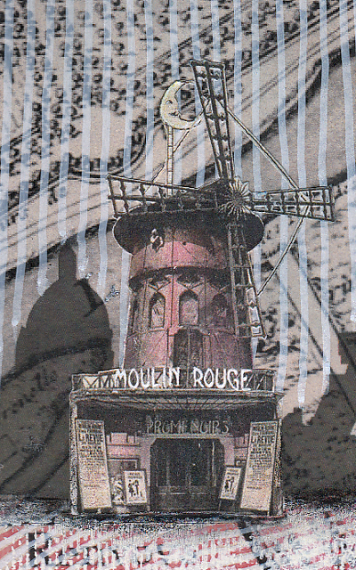
The challenge at Simon was simple: "Love is in the air" + red. So ... Paris is known as the city of love and the ladies of the Moulin Rouge (that's French for red mill) are doing did their best to promote it.

 
 I began with an image of a medieval map of Paris and a silhouette of the skyline. And I couldn't resist the Can-Can girls so I looked for an image of the Moulin Rouge to accompany them.
 
As far as technique goes, I thought I'd explain the background. The map was busy and most often, artists will use a wash of gesso or white paint to blend back an image creating subtlety. But I wanted to try something different.

So I used white and red paint pens to draw lines over the surface of the map and I rather like the effect.

 
I always try to create the illusion of depth and the vertical and horizontal lines help to achieve this along with using lighter brighter colors in the foreground and darker colors in the back.

The scale of the objects also helps create some perspective since the ladies are larger than the buildings.

In case you are wondering, this is a two-page spread in my large Dylusions journal which is 9" x 11".

January 21, 2016

Got Friends?


Aunt Butch (or Butch)--that's what everyone called her. It was the nickname given to her by my Dad. She's the one on the right and her real name was Olive Lee.

The photo was taken in my Grandmother's backyard and because of the hats, I suspect it might have been her birthday. I don't know why she looked so sour with that "it's my party and I'll cry if I want to" expression but in truth, it was her nature to never smile that much.

But I digress. This post isn't meant to be a sharing of family history, rather, it's a chance to talk about a photo tinting theory that played out rather well.

In a previous post, I mentioned using clear gesso over black paper to create a chalkboard effect using pastel pencils and that made me wonder, would this technique work for tinting black and white photos?

The answer is yes and rather well, I might add.

After stamping and tinting the background and pasting on the girls, I covered the tag with a layer of clear gesso then used pastel pencils to tint their clothing and put a little color in their cheeks. The trick is not to apply too much since pastels are generally not very transparent and you could lose some of the photo's detail if you did.

Would I use this technique again? Definitely.

I chose this photo and made this tag so I could link to Simon's Monday blog challenge where this week's theme is Best Friend.

Stamp credit: Tim Holtz Dots & Florals

January 19, 2016

Grateful and Happy


Grateful and Happy, the names given to the last two projects I completed for CHA 2016, describe perfectly just how I felt about being asked to contribute. They were assembled on the new Idea-ology Mini Clipboards which are a great size and so much fun to decorate.


The first one features a Watch Cameo that comes with it's own glossy epoxy sticker cover for mounting an image (I used a Found Relative). Other new elements include Plain Tissue Wrap, Mirrored Hearts and Gilded Accents Remnant Rubs along with some old favorites like Chit Chat stickers, Crinkle Ribbon, a Nature Adornment and paper from the Wallflower stash.

I used tiny drops of Liquid Pearls (Ranger) around the edge of the clipboard for some extra bling.


The second clipboard was made by covering it with Wallflower paper (the clip has screws that allow for easy removal) and then attaching a new Vignette Panel on top which served as a support for my assemblage.


The panel is made from wood so I used some whiting to distress and lighten it then sanded it down to expose the grain.


A Flash Card, an image from the Photobooth collection, a Nature Adornment, some Remnant Rubs and paper from the Wallflower stash all went together so easily to complete it.


I hope I've inspired you with my projects, I sure had fun making them! If you missed my other CHA 2016 posts and would like to see them, here's a link.

Forever Young


Using the lid from a vintage cigar box this piece, made for Tim's Idea-ology booth at CHA this year, features:

a Curio KnobVignette Boxes, Letterpress, Big Chat, Thrift Shop Ephemera, Apothecary and Corked Vials, an Ornate Plate, Hex Fasteners, Alpha Dice, Box Corners and the new Dapper paper.

And it all started with an idea to cut-up a group photo and put people inside bottles.


I used an Occasions Found Relative for this one that featured children dressed-up in their Easter best. You can also see the Dapper cigar box strips that worked perfectly to cover the front edge of the Vignette Box.

I'd also like to point out the apothecary labels that come with the new brown vials--they make the bottles look so authentic.


To place the children inside, I removed the backing from the photo, cut-out the individuals then curled them slightly so they would fit through the neck of the bottle. To anchor them in place I used a bit of Glossy Accents and the end of a long toothpick as an applicator.


The Alpha Dice makes it easy to spell-out a variety of words as there are multiples of the most common letters in each set.

But for me, the single-most important element in this piece was the blue background paper from Dapper. I had experimented with a variety of papers before choosing this one and the moment I placed it in the background the assemblage was instantly transformed. It's really a terrific collection and I can't wait to see how others might use it.

If you're interested, here's a link to all the projects I made for this year's event.

January 16, 2016

Moments


I'm sharing another CHA 2016 project made for the Tim Holtz Idea-ology Booth today and it features one of my favorite new products--the Decorative Dome.

I placed a tiny tree branch inside, draped with a bit of feathery crochet yarn and set a tiny butterfly cut from the Wallflower paper stash on top.

Next to it is one of the new wooden Alpha Dice cubes along with a Salvaged Doll that was tinted and distressed with crackle medium.

That frame in the background? Also a new product (called Baroque) and inside is a big blue bee from the Wallflower stash embellished with some Remnant Rubs.


All of that goodness was mounted inside one of his new Vignette Boxes and the edges were trimmed with cigar box strips from the new paper stash called Dapper.

Just below that is a new Vignette Panel which can be used as a lid for the boxes or, in this example, as a surface/support for the new Mini Pocket Watch and Charms. The topper is a painted Nature Adornment and the panel features insects from the Wallflower stash. The number strip along the bottom is from Dapper.


Everything was assembled on the inside of a vintage cigar box lid lined with walnut stained burlap and a large cut-out from Wallflower. A Mini Plaquette sits in the top right corner.


I hope this post gives you a few ideas or inspiration for your next creation and here's a link to the rest of the pieces I made this year for CHA if you'd like to take a peak.

To see everything available in Tim's new release, go here. Also, I find it handy to use this page on his website to see all things Idea-ology in one place with good descriptions and also measurements.

January 13, 2016

Remix


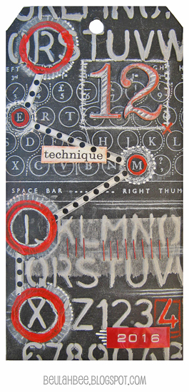
Tim's doing a "Technique Remix" for the 12 Tags of 2016 and this month he features metal embossing and chalkboard stamping. What a combination!

So even though I really tried to use more metal (three tags are in the trash as I write this), the best I could do was pull off the chalkboard look. In spite of my failures it was great fun just to try.

I thought I'd share my discovery for making your own chalkboard paper. Either start with black paper or make your own with paint or black gesso then coat it with what's known as clear gesso.

It's meant to be used mostly for pastel artists who need "tooth" on their surface for the powdery pastels to cling to. It's basically clear acrylic medium with a bit of fine sand mixed in.


First I used Tim's Schoolhouse stencil on a black tag to apply texture paste that was tinted with gray paint. I let it dry, stamped with Tim's Type Keyboard using white pigment ink and clear embossed it.

Then I applied the clear gesso over everything so I could use a white charcoal pencil to give it that chalkboard look.

Remember the grungeboard die-cuts from Tim's early days? That's what I used for the big number 12. Painted with black and clear gesso, they were easy to tint with a red pastel pencil and more white charcoal to keep the chalkboard theme going.

Some circles stamped with red paint, a bit of washi (polka dots), tissue paper and two more design features from Tim's early beginnings--mini staples and Dymo tape (the red 2016) provided the final embellishments.


I may have drifted from this month's remix but embraced what I've learned from following Tim's tag tutorials for such a long time and am excited about this year's new twist. I think it will be great fun to revisit these oldies but goodies.

January 11, 2016

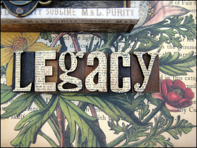
Legacy

Every book has a story and this one began when I pasted the pages together and cut-out its center.

Its final chapter ends with a stint in the Tim Holtz Idea-ology booth at the 2016 Craft and Hobby Association Convention in Anaheim, California (CHA).

Photo Courtesy Paula Cheney via Instagram

It features three of Tim's new Idea-ology products for this year--a Vignette Box,


some Gilded Accents Remnant Rubs and the Dapper Paper Stash (cigar box strips used along the box front edges).


I also used some old favorites like the Wallflower Paper Stash, a rather famous Found Relative, some Thrift Shop Ephemera and Letterpress.

My idea for stamping onto the letterpress faces came from some artwork by Paula Cheney that's featured on Tim's packaging for the new Framed Panel. If you haven't seen The Flamboyant Mr. Albert (and Paula's great tutorial) here's the link.


The vintage postage stamps are courtesy of my Great Aunt Esther who was a collector and left them to me. One is from Argentina and the other is Belgium.


It was a thrill to be asked to contribute artwork for Tim's booth display because (as so many of you know) working with his products just invites creativity. To see my other CHA projects, here's a link.

Photo Courtesy of Mario Rossi via Instagram

So that's the story with the following epilogue: This book will soon return to anonymity and never again be seen in such magical surroundings!

- The End -

January 02, 2016

Morning Glory


It's illegal to grow Morning Glory flowers in Arizona. Too bad because I really like them. They grow fast, attract hummingbirds and open and close each day which is pretty cool to see.

My attempt at drawing them came from a Haiku poem I thought especially appropriate for the new year and was my inspiration for this journal page. That, along with a photo I fell in love with of two charming children gathering sea shells that I placed alongside a very old Japanese print of a grasshopper.
It felt good to spend time in my journal and I couldn't help but contemplate various New Year resolutions as I worked. Like how I should try to draw and paint more (which is harder) and paste less (which is easy).

The only thing I know for sure is that time passes by way too fast so I better stop wasting it!