/* */ Beulah Bee: big stamps
Showing posts with label big stamps. Show all posts

July 21, 2021

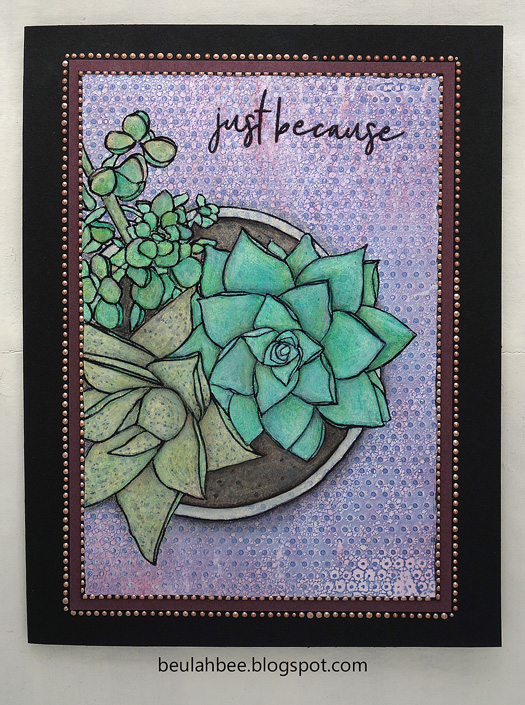
Just Because

Greeting Card

This greeting card features the Mondo Succulent Pot stamp by Ellen Hutson. Back in January, I posted a similar card using this stamp with watercolors (link) and say again how much fun it is to color.

Large stamps make quick work of card making but this time I used a less conventional technique so it took longer. Here's what I did.

The background? It's a print off a Gelli Plate using Simon's Tiny Dots stencil. I "zhuzhed" it up a bit with Distress inks, water and some sanding.

My stamp impression wasn't that great (some lines were too light) so I went over all of them using India ink and a pen nib. It was a good save. ☺

I filled it in with diluted white paint to knock-back the background then used watercolor pencils, inks and regular colored pencils.

I mounted it on dark mulberry cardstock and trimmed it with Liquid Pearls. The text was embossed.

As always, I hope this post finds you well and happy and I appreciate your visit.

Until next time, take care.

July 14, 2021

Possibilities

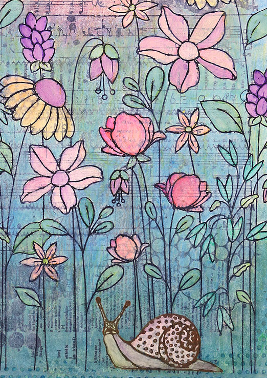
Journal Page

I created a journal page using some new supplies--Carabelle Studio's Stitched Mixed Media Background, Simon's Floral Garden stamp and their Tiny Dots stencil.

I stamped the background first, stamped the flowers on top, then used white paint to fill-in the flowers and a watered down version of paint to knock-back the background. The color came from water-soluble oil pastels, inks and colored pencils.

The snail was stamped (Carabelle), cut-out, pasted on, filled-in with paint and tinted with inks. The text is from Tim Holtz (I peel the thick cardboard off the back). The border was hand drawn with a black fine-tip marker.

Journal Page
 

I'm linking up to Simon for this week's theme, Lazy Days of Summer.

As always, I hope this post finds you well and happy and I appreciate your visit.

Until next time, take care.

January 27, 2021

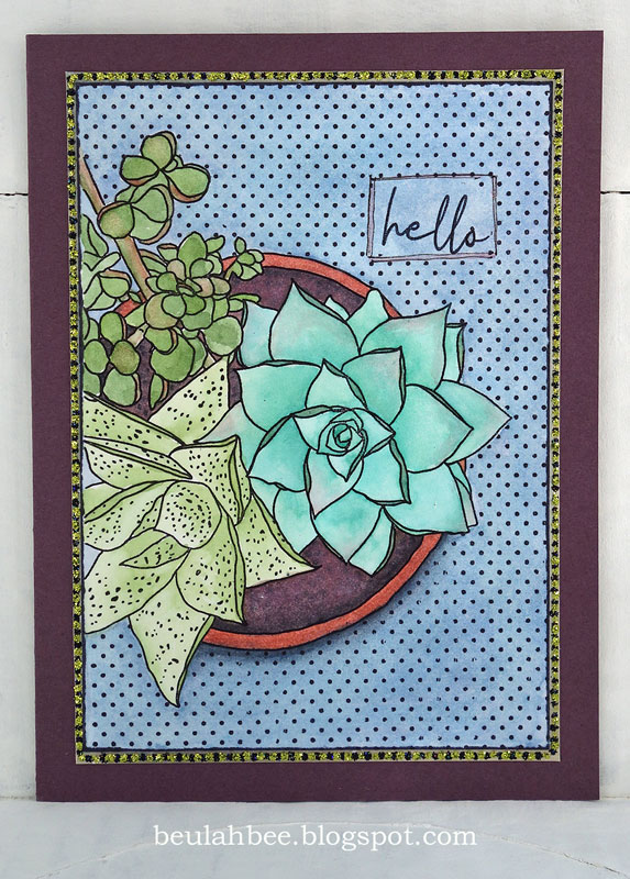
Hello

Mondo Succulent Pot
 

Not sure what to make of this greeting card--I like it but I know it's not for everyone (it's not very conventional).

I used a newly purchased stamp by Ellen Hutson called Mondo Succulent Pot. I've had my eye on it ever since it was released (2019) and after using it the first time, I know it will be quite versatile. I'm glad I got it and expect to use it a lot.

It was watercolored but I didn't like the blue background (too plain) so I stamped over it with polka dots (Tim Holtz). I framed it with a layer of paper then that little voice inside my head said use some Stickles and now it has yellow-green and black dots of bling.

If you're new to watercolor, a large stamp like this is ideal. I'm not a fan of "no-line" techniques and with a hand-drawn stamp like this one, the lines are what make it so charming.

One criticism about the stamped text: The set comes with the word "Hello" but honestly, the way it was made/written it looks more like "Hells" (here's a link to the vendor if you are curious). So I scratched out the center of the letter "o" because I thought it would help. Maybe I'll find a better remedy when I use it again. Maybe it's just me?

As always, I hope this post finds you well and happy and I appreciate your visit.

Until next time, take care.

December 15, 2020

Happy Holidays


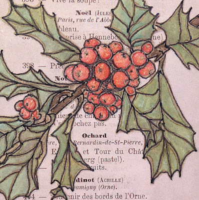
A greeting card to share today representing a milestone for me as it's my first creation since relocating my crafting space. Abandoning my old studio after almost 15 years was traumatic and because I had to downsize, I cleaned up and donated a lot of extra material. My new space is doable but I'm struggling to remember where I put stuff--I guess the easiest fix for that is to just starting making again!

For this card, I distressed the edges of printed papers and used some hand-stitching and Stickles on the border. The stamp is from Ellen Hutson (Mondo Holly by Julie Ebersole) which was altered quite a bit.

First I heat embossed it, then tinted it with Distress inks, ironed off the embossing, redrew the lines with a fine line marker, fussy-cut it and added Distress Rock Candy Stickles to the berries.

Happy Holidays, close-up

Happy Holidays, side-view

I plan to continue blogging about my creations (even though many bloggers have left the pack) because it serves as a kind of diary and good reference tool. Now that my numerous family projects/obligations are winding down, I have more time to create and will be able to post more regularly again. I also post snapshots of my blog entries on Instagram @123beulahbee for those who like to click-and-run ☺.

As always, I hope this post finds you well and happy and I appreciate your visit.

Until next time, take care.

December 18, 2019

12 Tags for Christmas 2019 - Believe in the Magic


So, all it takes is a prompt from Simon's Monday challenge and I'm off! This week's theme is "Cityscape" (add some buildings) and that was the inspiration for tag number eight.

The building image (Carabelle Studio Dans la Rue) was stamped on old book paper, tinted with inks and colored pencils then embellished with dimensional dots painted and glittered to look like Christmas string lights.


The little miss was cut from a Found Relative (Tim Holtz) and the kitty looks just like Howie, my cat, who turned 18 this month. It's Christmas everyday for this little guy who I spoil beyond belief!

December 13, 2019

12 Tags for Christmas 2019 - Snow Berries


I've got carols a' playing as I prepare this post (David Archuleta's "Winter in the Air") and I am grateful for this time to play and for music of all kinds that I simply couldn't live without.

Stamping of holly berries (Mondo Holly by Julie Ebersole) on watercolored paper along with a bird cut from the Tim Holtz Wallflower paper stash, snow flakes courtesy of a Simon stencil--that's what I used to make tag number 7 of 12 for 2019.


I thought you might appreciate the technique I used for masking and alignment of my stamping so here's a photo to illustrate.


I taped together the masks, laid them on the tag and used an ink blending tool and light colored ink to tap along the mask edges to create an outline I could use to accurately align my stamping.

I'm linking this post to the TFJB Challenge Blog: It's the Holidays.

Use the link on the sidebar or the 12 Tags label at the bottom of the page if you want to see more of my Christmas tags.


December 05, 2018

12 Tags for Christmas 2018 - No. 6 & 7


I'm doing a look-back to Christmas tags of the past (see previous post) and this one was inspired by a crackling technique Tim demonstrated on one of his early tags.

I was probably listening to the Nutcracker Ballet when I thought of the design 😏 and, with a very limited amount of crafting supplies back then, I found a pattern for the ballerina and cut her out of card stock by hand.


The background stamp is the classic Tim Holtz Flourish and I may have hand-drawn the numerals. The snowflake sequins were dabbled with paint and glitter and a ribbon was used for the ballerina's tutu.

I am sharing this next tag for a remarkable feature that looks excellent in person but impossible to capture in a photo. Let me explain.


Santa's face is a clip-art photo that was printed onto a transparency (used with an overhead projector in the "old days" for business meetings). Then I placed the image in front of a sheet of metallic silver paper before I set it into the frame.

The effect is truly astonishing and the image takes on a vintage quality similar to that of mercury glass. It's hard to describe but I highly recommend trying this technique so you can see what I mean.


I'm linking this post to Simon's Monday Challenge Blog ("B is for Ballerina").

October 23, 2015

Birds


When I was a kid, there weren't many horror movies compared to today and they were pretty harmless by comparison. But I'll never forget one that really scared me and gave my sister nightmares--it was The Birds by Alfred Hitchcock.

So I made this tag for Simon's Monday blog challenge where this week's theme is Monster Mash. I used Distress inks and two stamps by Tim Holtz (the large bird and filmstrip) and one by Penny Black (Winter Ledge). The house was an image transfer of the school building from the movie and I hand-lettered the text.

September 24, 2015

Sparkle

Click to Enlarge
The most difficult stamp I have ever worked with (and also the most expensive) is this image by Lynne Perella for Paper Artsy. I don't know why it's not available in the US so I had to order it from the UK and the shipping added a greal deal to the cost.

It has a tremendous amount of detail and is not deeply etched so it's a bit of a struggle to get an impression that's satisfactory.

This time I used a really bizarre inking method that worked rather well. Surprise, surprise.

I applied thick watercolor using a brush and let it dry then stamped over that layer with black dye ink. Then I lightly spritzed it with water and stamped onto my paper surface.


The paper border was made with one of the most useful stamps I own and if I had to pick a favorite from my collection this would be it because it's so versatile. It's from Tim Holtz and is part of the Visual Artistry Lost and Found stamp set.


The text is Idea-ology chit-chat and the dots are Ranger Liquid Pearls.

I made this card for my bestie Thelma who's got a milestone birthday on the horizon and I'm linking to Simon's Monday blog challenge where this week's theme is use a stamp.

I must give a special shout-out to all the Design Team members who really rocked their creations this week. It was very inspiring!

March 28, 2015

Prototype


This week's Monday blog challenge at SSS is to use a stamp multiple ways on the same project or use the same stamp in different colors or ways on multiple projects.

So I read through Michelle's creative stamping tutorial, then chose a stamp to experiment with that's always been hard to use--it's large, not very deeply etched and yes, a bit unusual. I was hoping this exercise might shed some light on how to get more out of it.

As she suggested, I just starting making impressions on all kinds of scrap papers. Then I got an idea to cut various parts out of the image from the many stampings and collage them back together puzzle-style.


Click to Enlarge
I ended up making a tag which was embellished with a little paint and ink.

If time permits, I like to try another one and will tell you that I like this stamp a whole lot more than I used to.

This was a great exercise and I always appreciate the inspiration I get from the weekly challenges.

Stamp credit: Paper Artsy

March 08, 2015

Explore Life


Tim's March tag for 2015 is a lesson in masking and using embossing powders with texture paste. I have three tags in the trash that just didn't pan out but believe me, I tried. My failures may be related to not having the right mediums so I just had to do things differently.

I don't usually step-out my techniques but, in this case, I thought it would be useful to demonstrate my process (click on the images for a larger view).

I began by pasting a paper from Tim's Crowded Attic paper stash onto a manila tag. They are images of vintage stamp pads and one of my all time favorites.

Sometimes it's hard to visualize where best to place a stamp so I made an imprint on some acetate that I used to try out different arrangements.

I stamped the image using Perfect Medium and clear embossing powder because I wanted to create a resist.


Then I applied a coat of Seedless Grapes Distress Stain and let it dry followed by a second coat of Vintage Photo stain.

As you can see, the embossed image resisted the stains perfectly!


To remove the embossing, I used a hot craft iron and absorbent paper (newsprint is best). The iron re-melts the embossing and the paper absorbs it. Make sure to pull the paper off immediately after you heat the image otherwise it will cool and the paper will stick.


Tim calls this next technique "stamp-to-stamp." I wanted to fill-in the bird so I stamped a library stamp onto the bird stamp then re-stamped the bird onto my tag (whew!).

Hopefully, the photo will help to explain what I mean.


No rocket science for the next step which was simply a matter of sponging paint through Tim's Burlap stencil.

I went over some of the stenciled areas with Black Soot Distress Ink to provide a variation of color.


Tim always says, "it's in the details" so my final touches include a Remant Rub over homemade tape, a touch of Peacock Feathers on the raven's body, a gel pen for the black dots, a black colored pencil to outline one edge of the bird and a white gel pen to bring out a few highlights.

I admit I didn't follow along very well this month but I really like Tim's composition and the idea of using a large bold stamp along with the stencils. I think part of the appeal of his tag is the strong contrast of lights and darks which I tried to aim for.

The monthly tags always make me push my boundaries and try new things which must be the reason I enjoy it so much.


Here's a link to more information on the emboss resist technique from one of Tim's tutorials that explains it perfectly.

And here's a video from Tim that demonstrates the stamp-to-stamp technique (skip to the 6:45 minute mark to by-pass the embossing folder info). I kind of wish I had watched this demo before starting my tag. I would have done things differently but will definitely try this technique again.

Stamp credits: Stamper's Anonymous Scratched Raven and Library

March 06, 2015

Rosie Evening


I am happy to share this two-page journal spread with you today thanks to a prompt from Art Journal Journey where this month's theme is things with wings.

I know I should draw more but I just don't enjoy it as much as cutting and pasting. I have to work at it and I guess I'm lazy. But I thought I'd give a go at drawing these birds using a text book as my guide after creating a background from stamped papers.

The white stamped squares were made with acrylic paint using a silicone pot holder similar to these.


The birds look very much like a pair of House Finch that currently enjoy the sunflower seed feeder placed right outside my window. While most of North America is covered with snow right now, many of our avian friends have come to the desert southwest for a visit.

January 26, 2015

In the Balance


I used to love spending time flipping through picture books at the library. I'd grab a few National Geographics, perhaps a volume on a famous artist or some books on travel. Anything with lots of pictures.

Now, thanks to the Internet, I can do almost the same thing right from home on my laptop. And when I find an image that really strikes a cord, I feel I must print it and do something with it. I guess it's a way of savoring it just a little more--becoming more intimate with it.

I altered an image like this one last year (see here) and believe this recent discovery is its mate (I wish I knew who the artist was so I could give credit). It's almost identical and I strongly suspect both images were made by the same artist at around the same time.

Click to Enlarge
It was cut out and pasted on a tag whose background was made by stomping white paint through a nylon mesh bag, stamping with archival ink and tinting with Distress inks.

I'll be on the look out for additional work by this artist and perhaps, finally discover who created them. If anyone can steer me in the right direction, I'd appreciate it!

Stamp credit: Stamping Bella Eclectic

January 15, 2015

Peek-A-Boo

Click to Enlarge
An ink-resist technique was attempted to create the background for this tag which I later altered for better effect.

I stamped a piece of watercolor paper cut to the shape of a tag with archival ink. I brushed on tempera paint to resist the space in between the squares. Distress stains were used for tint then I washed off the tempera.

While the paint did resist the ink, I decided I wanted the spaces in between the squares black so I filled them in with a fountain pen.


I found an image that, thanks to the photographer, was easy to alter to fit this tag. Now the girls are smiling about more than just a game of Peek-A-Boo.

I'm linking to the Monday blog challenge at SSS where this week's theme is Inky Background.

Stamp credit: #8346 by Dawn Houser for Inkadinkado

June 04, 2014

Sun Tarot


Design team member Dan has proposed a magic theme for the Monday blog challenge at Simon Says Stamp this week. Dan uses a lot of face stamps in his work so, to honor his theme, I've made a tarot card that was inspired by this image.

The background came from the Idea-ology Destinations paper stash, the borders were cut from French Industrial. The face stamp is by La Blanche. I used a fine-tipped marker, acrylic paint and colored pencils to draw and tint the sun rays.

Possible meanings associated with this fortune-telling card are:

Optimism—Expansion—Being radiant—Positive feelings
Enlightenment—Vitality—Innocence—Non-criticism
Assurance—Energy—Personal power—Happiness
Splendor—Brilliance—Joy—Enthusiasm

And so, since you are here -

My tarot tag has now predicted all of this for you!

May 14, 2014

Monarch

This week's Monday blog challenge at Simon Says Stamp is the letter M. Hopefully, the title of my blog post illuminates the connection.

I decided I must use a stamp this week since that is the store's emphasis and my link-ups tend to drift away from that more often than not.

So out came the most expensive and most frustrating stamp I own.

It was an impulse buy, designed by Lynne Perrella for Paper Artsy, and the cost made great due to shipping from England to the USA. What I failed to take into account when I chose this stamp is the large expanse of dark area and detail too fine to show up well when stamping.

It's challenging to add color and I've been most successful by stamping onto tissue paper, tinting the backside then pasting it on. I learned on this go around that my archival ink pad needs re-inking since this is a large stamp and it was difficult to get good coverage. I've also tried using detail inks and special stamping paper but seldom get a look I'm happy with. I expect I'll keep trying to master this monarch and was glad for a challenge that prompted me to revisit this love/hate relationship.

The background paper is by Bazzill and it's called Antique Script. The butterflies were cut from an out-of-print Graphic 45 release called Botanicabella. Distress inks were used and torn bits of tissue tape from Idea-ology. Now, pretend there's a hole cut in the top because I forgot to do that when I made this tag (oops).

April 23, 2014

Big Flower Little Bee

Still playing around with big stamps, this tag was made with a Jumbo Peony (Stampendous) and a bumble bee stamp from the Tiny Things stamp set (Tim Holtz), hence the title:

Big Flower Little Bee.

I also used another big stamp by Dark Room Door which is one of the largest I own, called French Script.

All I did was paste some canvas on a tag, stamped the background, the flower and the bees, tinted it with acrylic paint and oil pastels, distressed the edges and pasted on a strip of deli-wrap stamped with script.

I intentionally painted over most of the thick lines on the flower to give it a softer appearance.

I'm linking it to the Monday blog challenge at Simon Says Stamp (entry #3) where this week's theme is Big Stamps.

April 21, 2014

Apollo

This tag is courtesy of an Inkadinkado 3½" x 5" stamp called World Map and I made it for the Monday Blog Challenge at Simon Says Stamp where the theme this week is Big Stamp.

Apollo was cut from an old history book on the discovery of North America and I also used some Melange tissue paper.

What's unique here is the background and the tag itself.

A while back, I recycled some 300 lb. watercolor paper by covering it with gesso then put it away and forgot about it.

So today, when I began to apply watercolor to it (after I cut it into a tag shape), the watercolor wasn't sinking in because of the gesso. Duh!

So I sanded it down while it was still a bit damp and the edges became nicely distressed. Then I used watercolor which now absorbed into the paper more randomly than if it were a pristine surface. The blue color compelled me to use Apollo and the World Stamp because of the cloud and sea effect and, as they say, this tag is history.

Subway Shuffle


Using BIG stamps is this week's theme on the Monday blog challenge at Simon Says Stamp. Some themes really resonate with me and I'm motivated BIG time.  I just might break a record this week with the maximum number of entries!


The BIG stamp used here is called Subway by Tim Holtz which I stamped on a manila tag using Weathered Wood distress ink. I used an image cut from a magazine, some red balls cut from a Trader Joe's shopping bag, a piece of a Journaling Ticket (Idea-ology), and a very thin strip of scrapbook paper. I added a few 7-Gypsies number stamps to balance out the top right corner and trimmed the borders with a red gel pen and Black Soot distress ink.