/* */ Beulah Bee: drawing
Showing posts with label drawing. Show all posts

February 23, 2022

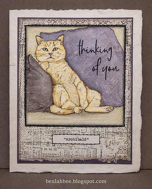
Archibald

Greeting Card

I came across an image in a woman's magazine that inspired this greeting card. I used a technique where you make a grid over the original with a smaller scale version on the support you plan to transfer to and took these photos to illustrate.

Here's a link to a video tutorial if you like to know more about this technique.

I used a fine quill pen nib and black india ink to go over my pencil drawing. Then it was simply a matter of tinting it with watercolors.

I finished it off by stamping a patterned border and a greeting. I made a typewritten "portrait" label and machine-stitched it to a piece of mulberry card stock.

As always, I hope this post finds you well and happy and I appreciate your visit.

Until next time, take care.

March 16, 2021

Heart Bird


 This photo was my inspiration to sketch and stamp a tag.


First I drew the bird then covered it with white gesso and created a mask before stamping the background (Tim Holtz Dots & Floral) with a medium blue archival ink.

The rest of the color and shading was done with colored pencils and the text is a Remnant Rub. The trick with colored pencils is to use a light touch and layer the colors as most are transparent.

I'm linking up with Simon, the Monday challenge this week is to recycle--where my plain manila tag becomes a tiny work of art.

As always, I hope this post finds you well and happy and I appreciate your visit.

Until next time, take care.

December 15, 2020

Happy Holidays


A greeting card to share today representing a milestone for me as it's my first creation since relocating my crafting space. Abandoning my old studio after almost 15 years was traumatic and because I had to downsize, I cleaned up and donated a lot of extra material. My new space is doable but I'm struggling to remember where I put stuff--I guess the easiest fix for that is to just starting making again!

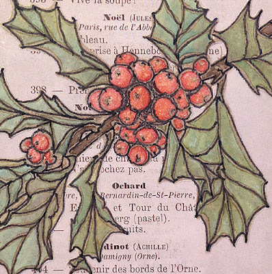
For this card, I distressed the edges of printed papers and used some hand-stitching and Stickles on the border. The stamp is from Ellen Hutson (Mondo Holly by Julie Ebersole) which was altered quite a bit.

First I heat embossed it, then tinted it with Distress inks, ironed off the embossing, redrew the lines with a fine line marker, fussy-cut it and added Distress Rock Candy Stickles to the berries.

Happy Holidays, close-up

Happy Holidays, side-view

I plan to continue blogging about my creations (even though many bloggers have left the pack) because it serves as a kind of diary and good reference tool. Now that my numerous family projects/obligations are winding down, I have more time to create and will be able to post more regularly again. I also post snapshots of my blog entries on Instagram @123beulahbee for those who like to click-and-run ☺.

As always, I hope this post finds you well and happy and I appreciate your visit.

Until next time, take care.

March 30, 2019

Automatic

Lyrics from a song by Miranda Lambert is the text typed on this tag that features wildflowers in canning jars.


It's my first time working with a stamp set (Tim Holtz Flower Jar) that has matching dies and I cut the images out of tissue paper so I could layer the arrangement without adding bulk.

The background is a page from the Tim Holtz Etcetera paper stash.

I used sepia archival ink on the flowers but in hindsight, I probably should have used black.

I tinted the flowers with dilute acrylic paint so it would be waterproof during the pasting process.

I like the scale of this set (it's tiny) but that does make it more tedious to use. And there are also some design challenges like a solution for the flower stems that appear inside the jar.

I penciled-in the lower stems but they would have looked better with more defined edges (less blurry). I'll work on my technique for the next time!

I think it would be very hard to arrange the flowers just by stamping so it's good that the coordinating die-cut set is available.

But I plan to give it a try--a clean white background with a delicate stamping would be nice on a greeting card. (I'll keep you posted.)

I'm linking to Simon's Monday challenge, this week's theme is Play with Paint.

November 19, 2018

12 Tags for Christmas 2018 - No. 2


May I present Tag No. 2 for this Christmas which I really enjoyed working on in a carefree manner with little or no planning.

I'm happy with the result and it was a good reminder that, too often, I overthink what I make and it gets in the way of fun.


After stamping the bird and text (Penny Black Festive Season) on a virgin manila tag, I used a stencil to trace the tree trunk and branches using a mechanical pencil with fine lead (which made it easier to get into the tiny spots).


Then I went over the pencil lines with a Uni Ball Vision Rollerball pen (Fine Black). I like this pen very much because it never clogs and the ink is waterproof. As you can see, I filled in the tree trunks and branches with additional line work in a loose and sketchy manner.


The background was painted in with watered down blue acrylic and I used colored pencils on the cardinal, berries, and Christmas text.

An oval frame (Tim Holtz Industrious Sticker) was placed around the text and some snow on the branches and other white embellishments were made with paint.


I'm linking this tag to the Penny Black Creative Christmas Challenge and to Simon's Monday Challenge Blog because this week's theme is "Let It Snow."

To see more of my Christmas tags you can click on the label at the bottom of this post or use the link I've placed in the sidebar.

April 20, 2018

Lemony Snicket

doo·dle ˈ/ do͞odl /
verb: 
scribble absentmindedly "he was only doodling in the margin"
noun: 
a rough drawing made absentmindedly

There's not much doodling here. It's a stretch for linking to Simon's Monday Challenge Blog this week but perhaps it counts that the first step I took was to make a border of circles around the tag.


The chair was stamped (Claudine Hellmuth) and then I drew the table. The globe and the hot air balloon were stamped (Tim Holtz Tiny Things); the books, shelves, windows, wall and floor were drawn.

I would argue that drawing and doodling are not the same. But if you consider the definition, I guess this was absentminded in the sense that I have no idea where the idea came from but once I decided to add the books, I thought the quote by Lemony Snicket was a good fit.

April 17, 2017

She Meant It


I'm sharing an art journal page with you today, made by transferring an advertisement from a magazine with gel medium then highlighting it with black and white gel pens, a Found Relative, some butterflies (from the Snippets ephemera pack) and text (from Clippings stickers). I also transferred book text to fill in some empty spots.


I was really drawn to the advertisement--a room with wonderful plaster and wood forms, a large framed mirror over such a decorative fireplace and one fabulous chandelier. How clever to furnish it with a modern style sofa and rug.

And so I began this art journal journey celebrating the page and becoming more intimate with all of it's interesting embellishments.


Update: After posting, I went to the ad's website (The Rug Company) and found the original photo so I thought I'd include it for another perspective. BTW, the rug comes in several sizes and prices range from $3,500 to $51,000! It's hand-knotted silk.

March 23, 2016

La Cucina


(Per Schiassi e Scarpelli)

My cooking skills have improved with practice over the years but in the early days of my marriage I felt like a child in the kitchen. My husband is Italian and no one cooks like his Mama!

The stamp used for this tag was found at a garage sale and seems very old (I think it may date back to the 1970's) and while I wasn't sure I'd ever use it, I was drawn to the image (perhaps because of my history?) and the price was right so I bought it.

With this week's theme of Food and/or Drink at Simon's Monday blog challenge I thought now would be a great time to use it.


I began with a page from an old cookbook which is now hard to see due to the many layers of distressing I used to make the walls look like old plaster. The floor, window and sign were hand-drawn, the bird was stamped and I placed a bit of washi along the sides of the window for trim.

Buon appetito!

March 03, 2016

The Red Chair


The journal page I share today was prompted by Simon's Monday challenge, Take a Leap Into the Unknown, and it was all that and more!

I took several photos of each stage so my post is longer than usual but I hope you'll enjoy seeing the process. As always, you can click on the individual photos to see a larger version.

I found this lady's image on the net and know nothing about her but wanted to give her a bigger presence because she is so captivating.

I took a leap and cropped out the frame, reversed the image, then printed the photo in a larger size than I normally work with so she'd fill up the page.


I applied polymer gel medium over my trimmed laser-printed photo, placed it on the page and once dry, began the process of rubbing off the paper to transfer the image.


I penciled-in a scene then went over the lines with a black paint pen.


The next photo shows how I used various stamps with black archival ink to create a pattern for the walls, an orchid for the window sill, and a face and frame for the picture on the wall. I also filled in her dress using black and gray paint then took a leap and decided to add bits of tissue paper to her skirt to give it more interest.


Then I took another leap and decided to use oil pastel crayons to tint the window because I knew they would be easy to smear and help create the look of vintage glass.

I used chalk pastels to tint the wallpaper and brown acrylic paint on the wall base and floor. The orchid was tinted with colored pencils because the design is so small a paintbrush wouldn't be practical.

The wall base looked too plain so I stamped a row of images using brown archival ink. My last color decision was the chair and yes, I took a leap, and painted it with bright red acrylic.


I wasn't too happy with the lady's skirt so I dug out some black tissue paper which I added in strips and then finally opted to trim the skirt with washi tape.


Here's one more look at the final outcome (so you don't have to scroll to the top) and in case you're wondering, my journal is the large format Dylusions by Ranger (each page measures approx. 8" x 11").


To learn more about my image transfer technique, click here for a post that further explains the method I use along with some tips. Maybe you'll take a leap too?

February 04, 2016

Orbital


Simon said "stamp," so I did. Same style/technique as the tag in my last post only this time I added my hand-carved owl stamp.

The drawing was copied from another, similar British Library image--this one came out of a Boston school atlas published in 1831.

Mine is decidedly more colorful.

I will again link to the Monday blog challenge where this week's theme is a ray of sunshine.


February 02, 2016

Eclipse

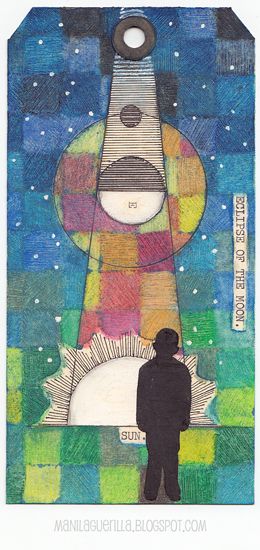
An eclipse cannot exist without a ray of sunshine.

Click to Enlarge
Sorry, Simon. While inspired to make this tag from the Monday blog challenge prompt which is ray of sunshine, I didn't use a single stamp in the process.

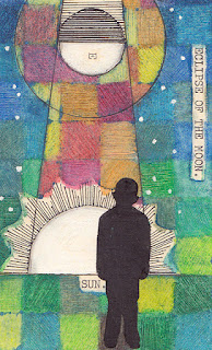
Instead I drew a diagram I stumbled upon at the British Library Flicker photostream (a favorite place to look for inspiration) and tried out a technique using oil pastels that's been on my to-do list for awhile.

Here's a link to the tutorial, the artist's name is Loretta Grayson.


Oil pastels are fun but messy which is the main reason I don't use them too often. That, and the fact that they resist water-based paints so are less desirable in mixed-media projects. Still, their resist quality can be useful and Loretta's tutorial helps to illustrate that fact.

They have two qualities I really like--they are smooth as butter and the pigments are strong. Here in the US, you can purchase a student-grade box for a reasonable price (I used Cray-Pas). If you've never tried them and like to experiment, then perhaps I've tickled your interest.

October 14, 2015

Mums


My entry for Simon's Monday blog challenge this week features a Tim Holtz Flower Garden stamp and watercolors.


I began by stamping the mums on watercolor paper with clear ink then used clear powder to emboss them.

Next I dropped in juicy yellow and orange watercolor, let it dry and then used a damp tissue to wipe it off the embossed lines.

I drew the likes of a basket and handle with my very handy Perfect Pearls pen, embossed with clear powder and filled them in with a brownish mix of watercolor.

Click to Enlarge

I used polka-dot washi tape to fill-in the basket around the flowers by pressing the tape down then cutting around the edges. A sharp blade and gentle pressure does the trick and prevents cutting into the background.

Then I masked the basket, flowers and handles so I could stamp the upper part of the tag with text (Heidi Swapp) using archival ink and tinted it with blue-green and magenta watercolor.

Final embellishments included hand-written text using a Gelly Roll pen, tacking on a bow and distressing the edges of the tag with walnut ink.


This becomes Tag Number 136 which I'll add to my collection at manilaguerilla.blogspot.com. But who's counting?

July 03, 2015

Swimming

Click to Enlarge
The daytime temps here in the desert have been hovering between 105 and 110 degrees for the last three weeks.

So, the only way to get outside and stave-off cabin fever is to find a swimming pool!

You have to park your flip-flops right at the pool edge because the ground gets so hot you can't walk barefoot.

I'm posting this journal page to celebrate a favorite summer pastime which was prompted by this week's theme at Simon Says Stamp.


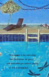
The ladies are an image transfer and I used a variety of stamps, stencils, acrylic paint, colored pencils and ink pens to make it. My hubby calls my hobby "coloring" and the term really applies here because I did feel the joy of creating like a kid with this one.

I inscribed the words from a song by Loudon Wainwright III called "The Swimming Song" to decorate my pages and thought I'd post the lyrics below since you can't read them too well in the photos.

This summer I went swimming, 
This summer I might have drowned 
But I held my breath and I kicked my feet and I moved my arms around, I moved my arms around. 

This summer I swam in the ocean, 
And I swam in a swimming pool, 
Salt my wounds, chlorine my eyes, 
I'm a self-destructive fool.

This summer I swam in a public place and a reservoir, to boot, at the latter I was informal, at the former I wore my suit, I wore my swimming suit. 


This summer I did the backstroke 
And you know that's not all 
I did the breast stroke and the butterfly 
And the old Australian crawl, the old Australian crawl. 

This summer I did swan dives 
And jackknifes for you all 
And once when you weren't looking 
I did a cannonball, I did a cannonball.

April 01, 2015

Life is Good


Spring in the desert means the state tree, called a Palo Verde is in full bloom and covered with a blanket of tiny yellow flowers. Yellow is practically the only color you'll see anywhere this time of year and it's pretty but also rather monotonous.

So I guess that's my excuse for creating this tag inspired by the pastel theme at Simon's Monday blog challenge this week.


Using watercolor paper cut in the shape of a tag, I painted the trunk then used a variety of small flower and leaf stamps.

Most were tinted with watercolor paint along with the background. Some I left white.

To create the pastel shades, I mixed white with my colors.

The bunny was hand-drawn on scrap paper and pasted to the tag. This way, if I didn't get the drawing right, I could just start over and not worry about erasing marks on the tag.

To frame the tag, I ran some Black Soot around the edges and bled the color using a wet brush.

Polka dots were made with a gel pen along the deckled edge and a Remant Rub was applied.

There are lots of bunnies here in the desert and they feast on the flowers that fall from the trees but I think life is real good for a bunny under a pastel flowered tree.


Happy Easter!

March 06, 2015

Rosie Evening


I am happy to share this two-page journal spread with you today thanks to a prompt from Art Journal Journey where this month's theme is things with wings.

I know I should draw more but I just don't enjoy it as much as cutting and pasting. I have to work at it and I guess I'm lazy. But I thought I'd give a go at drawing these birds using a text book as my guide after creating a background from stamped papers.

The white stamped squares were made with acrylic paint using a silicone pot holder similar to these.


The birds look very much like a pair of House Finch that currently enjoy the sunflower seed feeder placed right outside my window. While most of North America is covered with snow right now, many of our avian friends have come to the desert southwest for a visit.