/* */ Beulah Bee: glazing
Showing posts with label glazing. Show all posts

May 13, 2020

It's a Dog's Life


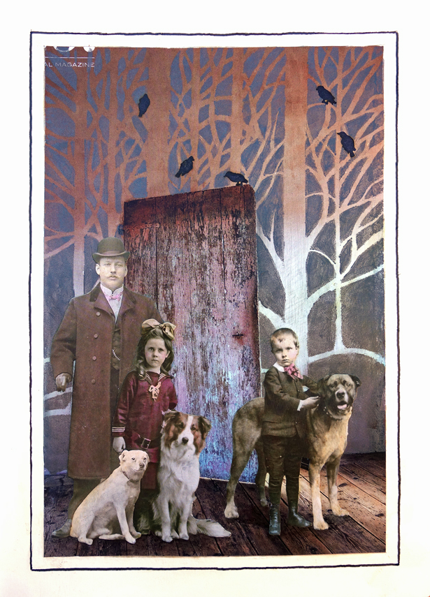
Inspired by this week's Simon Monday challenge, I'm sharing this journal page that features a trio of vintage canines (Tim Holtz Paper Dolls).

The background is the original cover page from a magazine which I hung on to because I thought it had potential.

It's tricky working with magazine papers as they tend to wrinkle and can be fragile so I use a glue called "Yes" because it doesn't buckle paper.

I used a stencil (Clarity Stamps Treescape) with some dark gray metallic paint and the birds were stamped on tissue paper before pasting down.

The paper dolls were peeled from their backing and most of the paper rubbed off to make them nice and thin which is my preference when collaging.

Both sides of the dolls were sealed with acrylic medium before assembly on the page to protect them and give them strength. I used various staining inks to tint them with a small brush.


As always, I hope this post finds you well and happy and I appreciate your visit.

Until next time, take care.

February 05, 2019

Wildflowers of America


I'm happy to be part of Richele Christensen's blog hop of artists who made show samples for the Tim Holtz booths at Creativation 2019.

This piece features Idea-ology and I used a Vignette Tray (large), new Vignette Divided Drawer, Worn Wallpaper, Butterfly Adornments, new Ephemera (Keepsakes), new/revised Layers (Botanicals), Bouquet, Mini Hardware, Corners, and Ball Chain.


I took the dividers out of the drawer, lined it with paper, anchored it inside a large tray, and placed 1/2" thick foam core around the circumference to make it less deep (underneath the Worn Wallpaper).

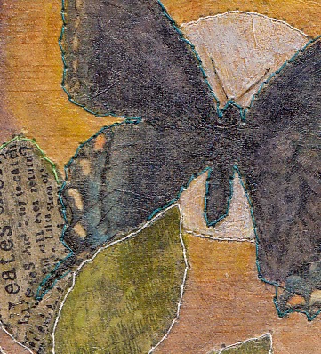
My technique for painting the butterflies is simple and all you need is a steady hand. I used thin acrylic paint and a tiny paint brush to apply multiple coats layering one transparent color over another.

The new/revised assortment of Botanicals (Layers) is really beautiful and was my inspiration for this piece. The mix of flowers is very different from the last release and much improved with lots of roses and lovely banner pieces all in multiple sizes of left and right versions.

Botanicals Layers - New Version
Botanicals Layers - Old Version

I also mixed in a few of the fabric-like flowers called Bouquet after lightly tinting the edges with Antique Linen Distress Ink.


The wire mesh in the background is made out of something called "hardware cloth." In my neighborhood, it's used as a fence around plants to keep the rabbits from chewing them.

I sponged on off-white paint and built a ledge for it to rest on from thin wooden strips painted to match the box's paper lining.

The Worn Wallpaper was distressed by placing torn strips over the top of one another and inking the edges to make them stand out. And yes, that's Ball Chain (it comes in three different metal finishes) which was used to embellish the border.


Good luck with the giveaway (comment by midnight PST February 9). The contest has ended, see winners announcement here.

I hope we've inspired you! If you are hopping in order, Cheiron Brandon is up next.

CREATIVATIONS 2019 BLOG HOP

Beulah Bee  YOU ARE HERE...

June 13, 2018

Precious Things


What to do, what to do...

I can't bring myself to use the papers included in this month's Simon card kit because they are just too pretty! Seriously.

And I couldn't bear to cover up the background of a tag made with a new embossing folder (Tim Holtz 3D Botanical) because it was just too pretty, too!

So I tried to think of a design where I could leave most of it showing and here's what I came up with.


I really played around with distressing the background. I embossed a rather thin piece of pink paper (after slightly damping it first) and then I gave it a coat of Krylon clear matt finish to seal and protect it.

Then I went crazy with gesso, inks, and paints--brushing on, wiping off (and even a little bit of sanding), just to see what worked the best to bring out those glorious embossed details.


Who could blame me for not wanting to cover this beauty up?!

The girls are Paper Dolls (Tim Holtz) and the butterflies came from the Graphics Fairy which I printed in miniature on vellum and then cut out.


Some tiny jewels (tinted with alcohol ink), a scrap of vintage sheet music, a Remnant Rub (text) and a border made with dots of Liquid Pearls were also used.


I tinted the Paper Dolls with transparent acrylic paint and the white of the pearls and lace were made with a Gelly Roll pen. I had a tiny butterfly that was just the right size for sitting atop the little girl's hair bow.

I'm linking this up to Simon's Monday Challenge Blog, this week's theme is Anything But A Card.

Now, what to do about those pretty papers...

April 11, 2018

Ada Again


I have modified a recent collage (see previous post, Ada 1916) by scraping off the photo of my great Aunt Ada and replacing the image with one I like better.

Because the original photograph was a bit thicker than the other collage papers I used, it was pretty easy to get underneath it and carefully peel/scrape it off.


Then I used this image as a transfer and created a mask of the hands and face. I used the mask to apply off-white paint on the background where the image was placed. Since image transfers are inherently transparent, this technique keeps the background from showing through.


The image transfer's darker undertones made it necessary to adjust values throughout the collage using transparent paint (glazing) and I also colored the collage paper flowers.

And finally, I felt the need to contain the composition by adding a border which was made using dots of Scribbles. I think the addition of the black accents helped to emphasize the other black elements in the collage.

January 14, 2018

According to Value


Value is defined as the relative lightness or darkness of a color. It is an important tool for the designer/artist, in the way that it defines form and creates spatial illusions. Contrast of value separates objects in space, while gradation of value suggests mass and contour of a contiguous surface. (Read more, here.)

Of all the things I learned in art classes, the concept of value has been the most significant and perhaps the most challenging to fully understand and implement. I work at it constantly and it can make a big difference when you get it right.

I thought I'd use this tag (my first for 2018), to explain some steps I took to adjust the values which you might find interesting or useful.
  1. The lady's dress was bright orange and this warm, strong color was too dominant. To adjust the value, I tinted it with transparent blue (Tumbled Glass Distress Marker). Blue is the complimentary color to orange and when you mix compliments, they cancel each other out. So the bright orange now has a more muted value and settles better into the background.
  2. The flowers were very neutral. I wanted them to stand-out more and appear closer (plus they needed some detail) so I tinted them with lines of pink, orange and turquoise gel pens (Gelly Roll Soufflé). Warm colors appear closer, cool colors recede.
  3. The lady was grounded by using a dark tint under her feet (otherwise, she would appear to be floating). It's subtle, but you may also notice that the grey background is lighter near her feet than higher up. This is a way to create a sense of depth. Distance (like on the horizon of a landscape) is imitated with lighter, cooler colors.
  4. And finally, most compositions are best when there is a mix of bright, dark and medium values. Here, it's the dark greys and black text combined with the bright white dots (extra-fine DecoColor paint pen). The remaining elements fall into the medium range.
If this information was helpful or interesting and you'd like to see similar posts in the future, let me know by leaving a comment.

October 26, 2017

Monochrome


A manila tag, a Halloween stamp set from last year (Tim Holtz), a vintage photo (reduced), Distress Oxide Walnut Stain and Versafine Onyx Black inks were used to create a monochromatic scheme as prompted by Simon's Monday Challenge Blog this week.

I found this to be quite challenging to make. First, I'm still getting used to the oxide ink used for the background's first layer. Then it took several stamping attempts to manage an arrangement of the single house stamp into the fortress you see before you. The Versafine ink is the best for bringing out the details of this really terrific stamp.

A poison label stamp (also from the set) was used for the base of the tag and I varied the degree of shading with a light wash of transparent black and even some diagonal scratching to create more depth and delineation between the two foreground planes.


The ladies came from a terrific vintage photo (source: Vintage Everyday) that I reduced in size before printing. Granted, the scale isn't accurate but I didn't want to lose too many details by making them super small.

I have to say working with a monochrome theme wasn't easy and creating a balance of light and darks in the same color meant thinking outside the box. But, I always appreciate the Monday Challenge prompts as I end up trying things I wouldn't have otherwise--so thank you, Simon!

April 11, 2016

No Trouble


I'm a Guest Designer for April at the Simon Says Stamp Monday Challenge Blog and if this is your first visit here--hello and welcome!


This week's challenge is Rain and/or Flowers and I'm super excited to feature one of the new Tim Holtz stamps for 2016 called Sideshow. 

According to Tim's blog (CHA 2016 Stampers Anonymous Sneak Peak), he discovered some mixed-media art, fell in love with the designs and purchased them to turn into stamps.

I too, fell in love and knew this set was a "must-have." This is my first time using them and since the man with umbrella/raindrops is perfect for this challenge, I had no trouble completing it!

I stamped the image on a dark blue page from Tim's new paper stash called Dapper using ColorBox Frost White pigment ink and Ranger's super-fine white embossing powder.

I used Ranger's Red Geranium archival ink to stamp text in different directions along the left hand side to fill-in the background.

I pasted on vintage postage stamps using Perfect Paper Adhesive (great product), stamped some numbers (which also came with the set) using Ranger's Cobalt archival ink and used Gelly Roll Souffle pens to emphasize and add color to the lines and text on the paper.

The pens work well for adding accents because they write on most surfaces (even acrylic paint/mediums) and provide a nice, dimensional quality.

I felt the man was a little too bright so I dimmed down the white embossing by applying a transparent layer of color using Old Paper ink from a Distress marker mixed with PPA which can also be used as a medium.

The ink helped with my values and also brought out an interesting texture in the embossing that was a side-benefit I hadn't planned on.

I look forward to using this stamp set for other projects--the design and style just invite creativity and I think they will prove to be very versatile. And I'm happy to have a stamp that's a little different from the standard fare!

----------------------------------------------------------------------------------

I really hope you'll join us for this week's challenge.

I want to see what inspires you!

And when you upload your creation to the Simon Says Stamp Monday Challenge Blog you'll have a chance to win a $50 voucher at the Simon Says Stamp store!


Here is a list of the products I used this week which can be purchased at Simon Says Stamp:


October 15, 2014

White Orchids


daguerreotype was my inspiration for this tag which combines an image transfer and stamping over some Tim Holtz tissue paper and glazing with acrylic paints.

A fair amount of masking was required to accomplish this task and I painted behind the transfer to prevent the background from showing through the photo.

I also filled in the orchid stamp (Stampendous) with paint and couldn't have done it without my favorite paint brush, a number 0 sable. It was a pricey investment but this brush is several years old and has lasted much longer than any other tiny paint brush I have ever owned.

I'm linking to the Monday blog challenge at Simon Says Stamp where this week's theme is the letter "O" and I just have to say--the alphabet challenges are my favorite!

May 24, 2014

Twilight


Linked to the botanical theme at the Simon Says Stamp Monday blog challenge, this tag was an experiment using tissue paper (from a sewing pattern) to unify the composition and impart a vintage color cast.

Click to Enlarge
After pasting down the leaves and butterfly, I completely covered the tag with tissue paper using Mod Podge. On some leaves, I stamped text on tissue paper pieces (Hampton Art/7 Gypsies).

I used transparent acrylic paint (except white) to bring back some of the color softened by the tissue and finished it off with a trip to the sewing machine.

April 29, 2014

Jaune


Not So Mellow Yellow is the Monday blog challenge at Simon Says Stamp, so...

I went looking for ideas on Pinterest, did a seach for yellow and found this house. I knew immediately that I must use it and remembered another image I had of a woman and brought the two together by way of an image transfer and a fussy-cut.

I really didn't do anything that technical but today but I thought I'd share the step-by-step process just in case anyone is curious.

  1. I have a toner-based printer (versus ink jet) and printed the house image using Photoshop in the size of the tag after reversing it.
  2. I stamped french script (Darkroom Door) on top of the tag with archival ink.
  3. Working quickly, I coated the front side of the image with polymer medium (gloss) and placed it on the tag front-side down, smoothed out any bubbles and let it air dry.
  4. I put a small dot of water on my table and dipped my finger in it to apply water to small areas of the image so I could gently rub the paper away.
  5. To avoid over-wetting/over-working (which weakens the medium), I kept moving to different areas on the photo and continued dipping and rubbing until all the paper was removed.
  6. Then I printed my woman after guessing at a size and cut her out of the photo using an Exacto knife and cutting mat.
  7. I used a brown waterproof brush marker to ink the edges which helps to blend them into the collage.
  8. I pasted the woman in place using Mod Podge.
  9. I didn't like the balance of values (lights and darks) so I added a strip of white tissue paper stamped with script to the bottom using a glue stick.
  10. I used gray acrylic paint to tint the strip, the sky, and most of the dark green values.
  11. I mixed a very transparent batch of lemon yellow acrylic paint and used it to tint the woman's dress.
I appreciate the skill of artists using photo-editing software to create digital imagery. I suppose I could learn how to do it and then create a tag like this one using only a computer and printer. But I really enjoy using my paint and glue and creating the old-fashioned way. I do admit, however, that I would be lost without my printer.

If you have any questions about my process, feel free to contact me, my email address in on the side bar.

March 04, 2014

Tick Tock


Some vintage photos ask to be understood more than others, it's a quality that draws me in and was especially true with this one--the couples' expressions and clothing tell a story I long to know.

I was inspired to use it because of the Monday blog challenge at Simon Says Stamp which is Tick Tock. The tag was an exercise in image transfers and this is what I learned:

A page of clocks from the Lost and Found paper stash was used for the background. Since transferred images can become transparent, I thought the background might be too dark so I put a thin coat of gesso over the clocks. But since the photo had a lot of solid dark areas, I really didn't need to lighten the background and if I hadn't, the clock images would have been more pronounced.

If you're wondering how I tinted the photo, it was "glazed" with acrylic paint. Glazing is just adding a clear medium to paint to give it a transparent quality. Best results are achieved with pigments that are naturally transparent and I avoid using chalky craft paints for this technique.