/* */ Beulah Bee: hand-cut stencil
Showing posts with label hand-cut stencil. Show all posts

December 24, 2018

12 Tags for Christmas 2018 - Tag No. 12


Good people all, this Christmas time,
Consider well and bear in mind
What our good God for us has done
In sending his beloved son
With Mary holy we should pray,
To God with love this Christmas Day
In Bethlehem upon that morn,
There was a blessed Messiah born.

(The Wexford Carol)

May the spirit of the season bring you peace and joy.

Thank you for being a part of my artful journey this year.

Merry Christmas and Happy New Year!

September 04, 2018

The Beekeeper's Daughter


I've made a Vignette Tray assemblage/collage to share with you today. I chose the smaller tray size and used whiting (a wood stain) and some light sanding to alter the surface. This technique is known as "pickling."

I used this finish on a CHA 2017 project and here's the link if you'd like to see another example.


A Found Relative was cut-out and placed between a sandwich of two Baseboard Frames and vintage book paper of a blue sky was attached to the back.

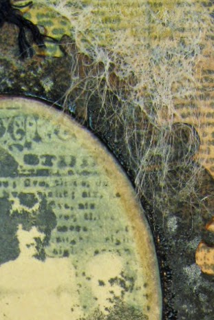
The background consists of the stained wood of the tray along with vintage book paper text.

The large white script was made using a home-made stencil and white paint on Plain Collage Paper.

By using the collage paper, I have lots more control over where it's placed and after pasting down it becomes almost invisible.


The tiny bee on top is an image transfer on the backside of a vintage button (I filled in the holes with paste medium).

The sunburst is also a transfer and the image came from a Trader Joe's flyer.

The gentlemen were cut from French Industrial paper stash and there's also a vintage postage stamp.


The flowers were cut from the Wallflower paper stash and that's an Idea-ology key dabbed with white paint and dark ink to distress it.

The honeycomb was made with a Tim Holtz Mixed Media thinlet.

This piece was a long-time in the making and there were several versions before I finalized it.

Funny thing, though--I ended up returning to my original idea. I guess I needed to try out all the possibilities before I could fully embrace the design.

June 22, 2018

Lina Cavalieri

Click on photo for larger, lightbox view

Someday I should start saving all my tag experiments gone bad so that you can see how this format is really meant to be my chance to try new things and to learn from my mistakes.

Occasionally, I get it right (in my mind, anyway) and those are the tags I blog about. This one, in particular, is a good example of what I'm talking about.


I wanted to try a variation of this Tim Holtz technique using a new stamp called Beautiful Flowers by Simon Says Stamp. It's a process of embossing, painting in the areas with acrylics, and then wiping the lines clean.

The paint I used was initially transparent so variations in flower color are due to the background (an image transfer over a book page) showing through. I applied another layer of a more opaque color on the flowers near the top to achieve more uniformity.

It was easy to lift paint off the embossed areas even after the paint was dry and I'll definitely try this technique again.


I thought the play of text and page margin under the face would be interesting but it was too severe so I applied a strip of Tim Holtz Tissue Wrap along the edge to soften the contrast.

To balance out the bottom I added text with texture paste and a homemade stencil. The paste was white. I've learned from experience that it's almost impossible to tint the paste black before you apply it because the best you can expect is maybe a dark gray.


So I took a teeny-tiny paintbrush dipped in black ink and painted the texture paste after it had dried. I've never tried tinting the paste with ink instead of paint so maybe I'll give that a go on a future tag. I also wonder if there's a black texture medium that you can buy?

May 17, 2018

Choose Joy


After playing with numerous stencils to create this journal page, it became apparent that I must get them better organized. I've ordered some clear vinyl sleeves and plan to place them all in a 3-ring binder.

This way, I'll know what I've got and use them more often as they really are a "joy" to work with.

Stencil It is this week's theme at Simon's Monday Challenge Blog and except for the red stamped script, washi tape and minor line work, everything you see on the page was made with a stencil (some store-bought, some hand made).


After applying the stencils, I gave the page a light coat of gesso then began to bring out the lines in the large lotus flower with a Pitt pen.


The next view shows additional line work and the beginning of value adjustments to put back some color. The nice thing about stencils is you can line them up with the original printing to finesse them as needed.


I added additional stencils of tiny leaves and the large text, some washi tape and a bit more line work to balance out the page.

Here are some close-ups you might enjoy--the last one shows how I used a stencil to mask the original printing and went over it with a text stamp.


January 11, 2018

Raised by Wolves

Photo is by Bernd Heyden

Collage is an interesting art form. Disparate images pieced together that hopefully, speak to the viewer in some way. Sometimes, the hardest part for me is knowing when to quit so I just go with my gut. I guess that's what everyone does.

A lot of my collages are dependent on what I have lying around at the moment that I grab and decide to include. It is a game of sorts and play has a lot to do with it. "I wonder what this will look like if I put it here?" is the ongoing conversation I have with myself.

So today, may I share another journal page/collage that started from a photo by Bernd Heyden that I was compelled to use. Raised by wolves? You may guess what band I was listening to while making it.

I'm linking to Simon's Monday Challenge Blog, this week's theme is "Winter Blues."

December 03, 2017

12 Tags for Christmas 2017 - Season's Greetings


Tag three of my 12 for this year's Christmas was an experiment using a hand-made stencil patterned after the original rubber stamp. I like to use Yupo for my stencil material because it is strong, waterproof and cuts like butter.


After pasting on a background of old book paper, I used thin white acrylic paint and the stencil to make a random pattern then stamped over the stenciled areas once the paint was dry.

I didn't worry too much about accuracy and you'll see places where the two (stencil and stamp) don't meet. But that's okay because the variations added interest in color and line.

My tints mainly came from Distress Oxides (lipstick and pistachio). I also used a light wash of white acrylic and a few watercolors, where needed, to adjust some values.

Platinum Stickles and Tim's Tissue Tape created a border that was darkened next to the inside edges with a bit of charcoal pencil.


Stamp credits: Penny Black Christmas Star, Echo Park Christmas Sentiments

November 18, 2016

12 Tags for Christmas - February


Monoprinting (a great way to get more mileage out of stencils) and embossed texture paste were the techniques presented in Tim's February tag--here's my Christmas version.

I stayed true to the monoprinting but....

The stencil image (a doily) just didn't develop like I wanted it to so I placed the stencil back over the printing and used paint through the stencil's negative shapes in the traditional fashion.

Without the special texture paste that Tim used, I had to improvise. But I came up with an alternative that yielded a new stencil in the process.

I stamped text on Yupo and cut out the letters to make a stencil then used brown-tinted paste medium covered with glitter.

I've said it before--Yupo makes great stencils (cuts like butter, is durable and easy to clean) and now I have a stencil I can use for future projects.


I love the Santa image from Tim's 2016 Christmastime Ephemera Pack (wish there was more than one) and framed it with tiny dots of Ranger's Liquid Pearls.

Stencil credit: The Crafter's Workshop (Mini Tatting), Stamp credits: Stamper's Anonymous (Christmas Words) and Inkadinkado (Christmas Silhouettes)

August 03, 2015

Mariposa


Mexico Moods is the summer challenge at Our Creative Corner and their prompt inspired me to create this tag.

Like my last several blog posts, this one features Souffle Gelly Roll pens. It seems I can't get enough of them and really went overboard this time! They are a bit like paint pens with a fine point and they're very opaque and waterproof.

I began with a black gesso background and stamped/embossed the butterflies and the lettering onto the tag. Next, I traced on a few designs with a pencil and some hand-made stencils.

Then the gelly rolls came out and were used to cover the entire surface with colorful mark making. To modify the values, I did use a glaze of thalo-blue in a few areas (particularly behind the butterflies).

The tag almost has an enameled appearance and makes me think I'd like to try this technique on a copper or gold background to see the result. Since they can be applied on any surface the sky's the limit!

April 17, 2015

Freestyle


I have finally tried out the last of the six flowers you get in the Tim Holtz Flower Garden stamp set. I think it's another Peony and it's been altered somewhat (more about this later).

Click to Enlarge
I call this tag Freestyle because that was the attitude I had while making it. I had no plan--I just starting doing stuff.

A bigger bottle would've been better (to keep the proportions right) but it was the only one I had and, anyway, a bigger bottle might mean a bigger tag and then where would it end?

I rather like the overall appearance though and discovered some interesting techniques that are sure to be useful in another project.

I thought I'd share exactly what I did so fasten your seat belts, it's going to be a bumpy ride!

  1. I covered the tag with a page from an old dictionary.
  2. I stamped the bottle, flower and stem with black archival ink keeping ink off one of the large petals near the base to make the flower smaller.
  3. I used colored pencils to create a rainbow-effect in the background.
  4. I used off-white to paint over the text inside the flower petals with a tiny brush.
  5. I stenciled some large script on a piece of deli-paper with black paint.
  6. I laid the deli-paper over the tag, traced the outline of the bottle and flower, cut it out, then pasted the remainder on the tag (leaving the bottle, etc., exposed).
  7. I used a harlequin stamp and archival ink on the background by using the cut-out scraps from my deli paper as a mask.
  8. I softened the edges of the impression with a bit of hand-sanitizer (which works great as an archival ink eraser on non-porous surfaces).
  9. I tinted the flower with dye ink and a water brush and added a light wash of white to the bottle and stem.
  10. I used black and white gel pens to make dots for accent. The black ones didn't dry so I used clear embossing power on them to speed things up and keep them permanent.
  11. I used my Exacto-knife to scrape the edges of the tag, wet them with a brush and then applied black dye ink.
Perhaps a word about deli-paper is in order. I use it for all kinds of things and it makes great paper for collages because it is thin and durable. It reminds me a lot of the same type of paper Tim uses for his tissue wrap.

Now that I've used all the Flower Garden stamps individually, I guess it's time to plant a garden but I'll definitely need to use something larger than a tag. I think I see a journal page in my future!

I'm linking to the Wednesday blog challenge at SSS where this week's theme is make your own background.

December 30, 2014

Rose et Noir


As the year comes to a close, I've begun my annual clean-up of the many bits of paper left-over from art projects made during the last 12 months that were saved "just in case." Some will be tossed, a few will be kept but most will be pasted on journal pages to commemorate, I suppose, what amused me this year.


This page began by randomly pasting old calendar stickers and later, dabs of white paint onto a pink tinted background. I used an adhesive silkscreen for the first time (by Martha Stewart) and it worked really well (lower left corner). You'll also see a bit a random stamping (Lace by Anna Griffin) and script (made with a homemade stencil) along with lots of tiny dots (Zig paint pens).

One thing led to another (which is my favorite part about working in art journals) and even though the end result would look better cropped, I'm happy with the color scheme just the same. The are no rules in art but I seem to prefer abstract collages with a stronger focal point than this one has.

I'd be curious to know if others save their scraps like I do and how they manage them. I could easily keep everything but the risk of being buried alive forces me to purge now and then. Now all I have to figure out is where to keep the accumulation of art journals that stand in their place. Pity the poor relation that will have to toss it all when I am dead and gone.

(I'm linking this post to Art Journal Journey, a blog I've just discovered that offer's monthly challenges for artists worldwide and a most clever way of displaying the work via Pinterest.)

October 08, 2014

Nevermore...


Here's my contribution for the link-up to Tim's October tag. I used the standard techniques: stamping, masking, embossing and inking, and Tim's Lost and Found stamp set, which is kind of "edgy" and suitable for this occasion. The raven is one of my own, hand-carved stamps.

The frame was made with texture paste and a homemade stencil but an error in stamp alignment forced me to do a cut and paste instead of applying the texture directly on the tag. Oh well!

However, I did make a useful discovery that I'd like to share.

I rubbed a dryer sheet over the paper prior to embossing (it's supposed to keep the powder from sticking where it shouldn't).

I ripped a corner off the sheet and discovered that the loose fibers make a rather authentic looking cobweb.

Nothing beats a typewriter for creating text, so I rolled the tag into the platen and was sure I felt Mr. Poe looking over my shoulder as I typed the word nevermore...

May 11, 2014

Cabbage Salad

Click to enlarge
I stumbled upon a person who collects images of women's fashion from the Civil War era and I've begun to follow her board. This discovery has prompted me to create collages using similar images. I hope to work out a series and this tag is my first go at it.

I'm also curious why, in many vintage photos, the subject looks so serious. Did no one say "cheese" when the photo was taken? I expect the grumpy face on this lady is why I chose to use her.

I began with a variety of papers including store-bought scrapbook paper, pages from a dictionary, a vintage cookbook and sheet music which I cut into small pieces and pasted on the tag.

After printing the lady, she was added to the tag using my image transfer technique. A homemade stencil was used to trace the outline of a frame with a fine tip marker and several areas were tinted with colored pencils to provide color and contrast. For framing, I cut thin strips from black and white striped paper and pasted them along the edges.

Why Cabbage Salad? For one thing, it's her expression and her face is rather round. And, if you look real close, you'll see that the cookbook's menu page has a listing for cabbage salad aka cole slaw.

April 18, 2014

Winged Things

A long, long time ago, when I was just a kid, me and the boy next door used to run around with butterfly nets, all summer long, because they were everywhere and it was fun to try and catch them. Thankfully, our aim was terrible and most escaped our grasp. But I rarely see butterflies anymore.

It's sad to think that today's children may be missing out on this adventure. Perhaps too much black pavement and too little green is the cause.


I made the butterflies using alcohol inks on a transparency, stamped with Archival ink, cut out and pasted to book paper then edged with Stickles.

The background is black gesso; the leaf layer made using paste medium with a hand-made stencil then tinted and distressed with acrylic paints.

The white marking was done with a very fine brush and white acrylic paint, a gelly roll made the text.

I've linked it to the Monday blog challenge at Simon Says Stamp where the theme is Winged Things.

April 15, 2014

Giselle


I was inspired to create this collage after visiting Paula Cheney's blog where she recently posted two excellent mixed media tutorials (Wonderful Adventure and Layering with Happy Colors). I love her artwork, she cuts right to the point in her tutorials and she talks about the "scary" parts. The end result has you reaching for a brush--fearlessly!

Aside from acrylic paint and paste medium, I used Melange tissue wrap, a Kaiser Craft stamp (flourish), a Crafter's Workshop stencil (mini tiles) and a hand-made stencil (frame corner). The lady was a gel medium transfer.

The Monday blog challenge at Simon Says Stamp is Winged Things, so I'm linking it there for a chance to win the weekly drawing. And I must do a shout out for design team member Andrea Ockey Parr whose creation for this week's theme is just charming!

I'm also linking to A Vintage Journey, where the theme is A Little Bit French, n'est-ce pas?

March 02, 2014

Royals


Is it just me or, are some of what seems like the easiest of Tim's monthly tags deceptively difficult? It took four tries to get a similar effect but it was great practice just the same. I'd either get a stamped impression that was too dark or too light or when I rubbed, it would smear too much.

I followed each and every one of his steps except I pounced ink through the stencil instead of using a spritzer, I didn't use a metal word band and my twine is a gold ribbon cut in strips and pasted on. I used stamps (PaperArtsy and Prima) with a similar format as the feather and the nest, my stencil was hand-made.

The text came from lyrics in a song called Royals by Ella Marija Lani Yelich-O'Connor aka Lorde who's from New Zealand. This song has received a lot of play time here so that's why I thought of it.

As always, I'm really looking forward to this month's link-ups and aren't we lucky that Tim provides such great tutorials (and products) and a forum for sharing our work! If you've never participated, I encourage you to try--it's really great fun.

February 26, 2014

let it go


e.e. cummings is the poet who inspired the text on this tag
(you can read the poem here)

I'm new to using paste medium and since I need the practice , I've made another tag for link-up to the Simon Says Stamp Monday blog challenge (a second-chance to win the prize drawing can't hurt either).

I just jumped in this time, spread medium all over the tag and pressed in a bird cage stencil. After it dried, the uneven texture made me think of hills and valleys so I used some acrylic paint and a landscape was born.

Since the impression on the side of the cage was messed up, the idea of birds escaping came to mind (déjà vu) and I found a Tim Holtz stamp that worked. Due to the surface's uneven texture there's no way I'd get a perfect impression so a few areas were filled in with a marker.

All in all, it was a good lesson. To be an artist means letting go, right? By treading new territory I've learned how this stuff works and see its possibilities.

Now I just need to figure out how to photograph it!

My cat will help.

February 25, 2014

Make a Bird Cage Stencil

First I found an image I liked
(thank you Graphics Fairy).

Then I used Photoshop to posterize it
to remove small details and thicken
the lines and then I printed it.

I taped the print-out on some
stencil paper (I like using Yupo).

Then I used a black marker to
highlight the areas I would cut.

The cuts aren't perfect but I
like the hand-made appearance.


The end result works as both a positive or negative image. The left image was made using the normal stenciling technique. The right image was made by inking the stencil then rubbing a piece of paper over it (like a collagraph).

Houses are for People

Paste medium and a stencil were used to create this tag but it fought me every inch of the way!

The stencil was hand-made and the paste emphasized the space between the bars and gave it a funny dimension.

So I scraped off most of the paste and re-inked the bars by hand.

Thank goodness I coated both sides of the tag with gesso before I started, otherwise, it would never have held up to the abuse.

I plan to make another bird cage stencil (this one's worse for the wear) and I'll post the steps I take so you can see my approach.

I'm linking this tag to the Monday blog challenge at Simon Says Stamp where the theme is Paste. The background is Idea-ology tissue paper and the birds were made with a stamp from Stamping Bella.

February 24, 2014

Sig and Gracie (in Print)

Have you heard that song by Pharrell Williams called Happy from the movie Despicable Me 2? It's nominated for an Oscar and topping the Billboard charts right now. It's a catchy tune that makes you feel happy when you hear it.

Well, that's how I feel today because I just received a magazine in the mail called Somerset Studio and the editors published my artwork in the Readers Expressions section of the March/April 2014 issue.

They regularly place calls for submissions and when the theme was "Le Cirque," I created Sig Sautelle and Gracie the Elephant and sent them in. If chosen, you receive a complimentary copy of their magazine. Here's a link to the current calls if you'd like to know more about it and maybe submit something of your own.