/* */ Beulah Bee: paste medium
Showing posts with label paste medium. Show all posts

February 24, 2023

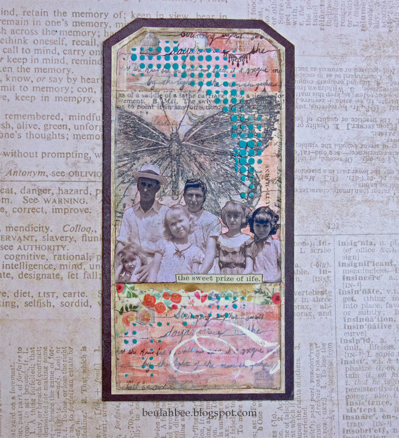
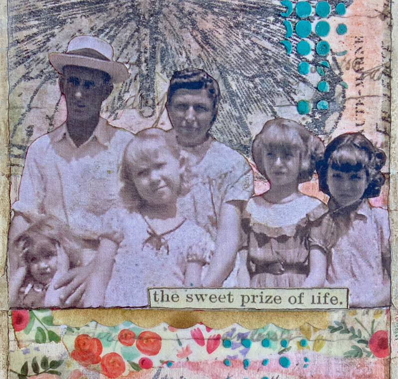
Sweet Prize

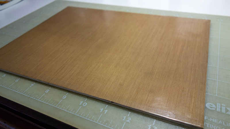
Today I'm sharing a tag inspired by, of all things, a new craft mat! (Which can only be said by one seriously bonafide and confirmed craft-nerd who, perhaps, should get a life?)

I started with a piece of scrapbook paper (Epiphany by Prima) for the background then layered scraps of Idea-ology Tissue Wrap, washi tape and stenciled tissue paper along with a hand-cut vintage image.

It was tinted with Distress inks and stenciled texture paste (Dot Fade by Tim Holtz). The text is a Clipping Sticker.

My trusty 10+ year-old Ranger Inkssentials craft mat was getting harder to clean and I didn't realize just how shabby it had become until I got a new one.

I keep it mounted on an inexpensive canvas panel with double-sided Scotch tape on the inside edges and strips of packaging tape around the outside edges. The back side of the panel is coated with gel medium to protect it from wetness.

This one is 9" x 12" and I use it most often but also have a larger one (14" x 18") mounted in the same way when I need a bigger work surface.

As always, I hope this post finds you well and happy and I appreciate your visit.

Until next time, take care.
December 15, 2022

No. 7 for Christmas, 2022

 
Yes, it's another Christmas tag (I'm on a roll this year) and it features a vintage Santa figure from a Tim Holtz Christmas ephemera release.

I began with a scrapbook paper from Stamperia (Christmas Patchwork) and applied a clear embossed stencil layer (Holiday Script) to act as a resist for some Distress ink tinting. I ironed-off the embossing (see technique here) to keep the background smooth so I could use a tree stencil (Clear Scraps Pine Trees) over the top.

I used a pencil to trace the stencil outline then a brush to fill it in with white paint. The dried brush strokes provided some texture made more visible when I used inks for tinting.

Santa was pasted on next then a border was added using Simon's Tiny Dots stencil and texture paste. Final touches include a Remnant Rub and Stickles.

I'm linking up to Simon's Monday challenge for this week's "Tag" theme.

As always, I hope this post finds you well and happy and I appreciate your visit.

Until next time, take care.
May 21, 2022

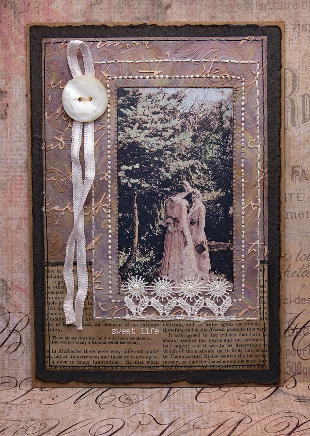
Sweet Life

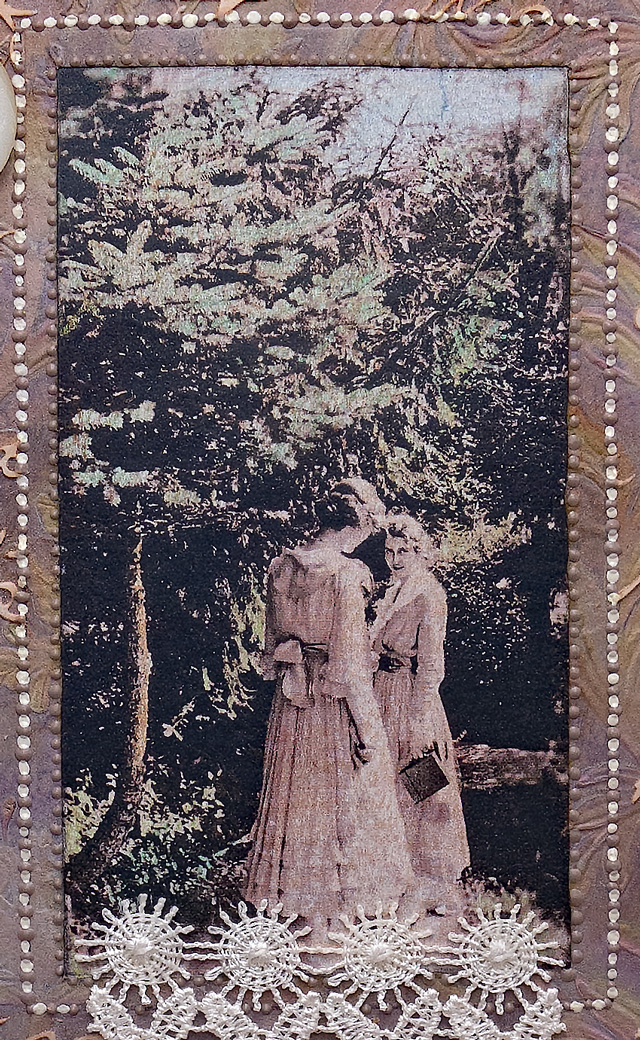
This piece was an exercise in texture using a copy of a vintage photo of my great aunt Esther (in the foreground) and a friend.

The photo was hand-tinted, mounted off-center behind tinted and embossed mulberry paper (Botanical Texture Fade), stenciled with script using texture paste (Finnabair Read My Letter) and anchored with tinted book paper and a piece of crochet. The embellishments include lots of hand and machine-stitching, dots of dimensional paint, a vintage button, satin ribbon streamers and a Remnant Rub.

I'm linking up to Simon's Add Texture challenge.

As always, I hope this post finds you well and happy and I appreciate your visit.

Until next time, take care.
March 06, 2022

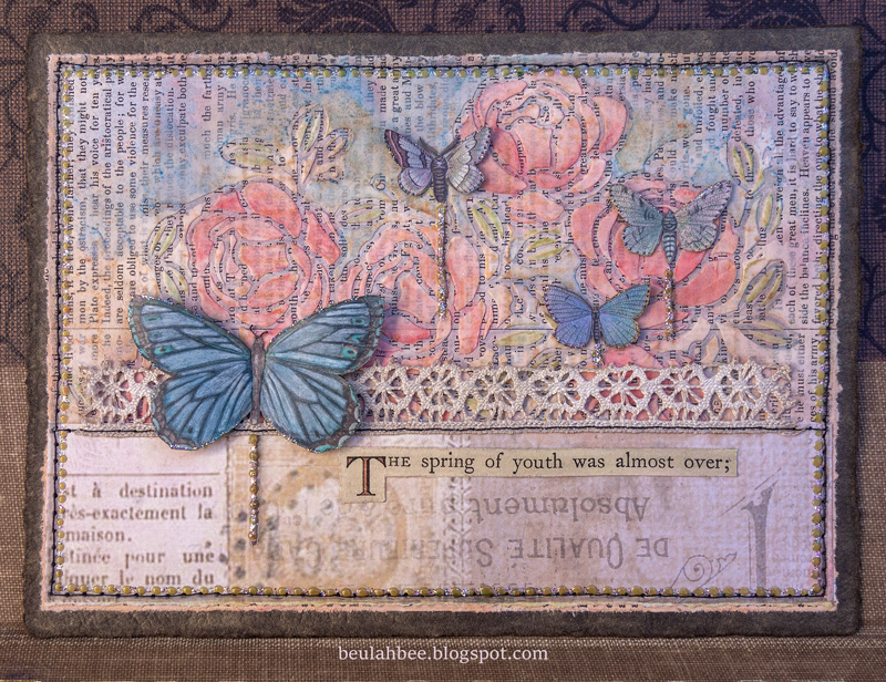
The Spring of Youth

Greeting Card

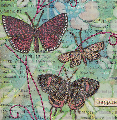
I made this card by stenciling with paste over a book page then tinting it with inks. The butterflies were cut from scrap book paper. I stitched it to a card and used dimensional dots and glitter for accents.


I'm linking up to Simon for the weekly challenge, "Use At Least One Stencil."

As always, I hope this post finds you well and happy and I appreciate your visit.

Until next time, take care.

September 17, 2021

Daughter of Atrides

A tag to share made with some Tim Holtz stuff: a Found Relative, a butterfly and a stencil called Thatched.

The Simon September card kit came with some of his Sentiment label stickers that didn't really appeal to me so I used them to cover a manila tag. Then I applied another layer over them using texture paste and the stencil.

I tinted the dress, skin tone and accents using Pitt artist brushes which are made from India ink, are waterproof, permanent and easily applied to the slick surface (highly recommend).

There are some collage bits: the text is from an old book, there's the crown and the flower-like accents (which are actually from an astronomy diagram).

I used some Liquid Pearls along the bottom.

I'm linking up to Simon's Monday challenge--this week's theme is to have "fun with stencils."

As always, I hope this post finds you well and happy and I appreciate your visit.

Until next time, take care.
August 15, 2021

Glitter Gone Wild


Gitter gone wild is the name of this post for obvious reasons--I used it to embellish this birthday card for my niece. (If you click on the photo to view it in the light box feature you'll see the glitter in more detail.)

I began by stamping (Simon's Delicate Flowers and a Martha Stewart butterfly) on watercolor paper with clear embossing ink and UTEE. Remember this stuff? UTEE stands for ultra thick embossing powder and I guess it fell out of favor because I seldom see anyone using it anymore.

After applying watercolors for tint, I ironed off the embossing. When you do, the weight of the iron spreads the embossing out and you end up with slightly thicker lines that also act as a resist. If you'd like to know more about this technique here's a link to a popular post for the particulars.

I thought I needed more contrast so I outlined the images with a fine-tip black marker. Still not happy, I dug out my glitter (Stickles) and the extra color and sparkle seemed to do the trick.

I used a stencil (Simon's Tiny Dots) with white texture paste, a Simon die-cut for the sentiment and machine-stitched it to the card base using white thread.

Simon Says use heat embossing this week so I'm linking up to the Monday challenge.

As always, I hope this post finds you well and happy and I appreciate your visit.

Until next time, take care.
July 14, 2021

Possibilities

Journal Page

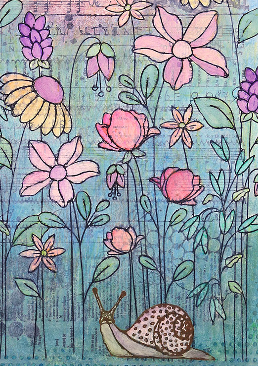
I created a journal page using some new supplies--Carabelle Studio's Stitched Mixed Media Background, Simon's Floral Garden stamp and their Tiny Dots stencil.

I stamped the background first, stamped the flowers on top, then used white paint to fill-in the flowers and a watered down version of paint to knock-back the background. The color came from water-soluble oil pastels, inks and colored pencils.

The snail was stamped (Carabelle), cut-out, pasted on, filled-in with paint and tinted with inks. The text is from Tim Holtz (I peel the thick cardboard off the back). The border was hand drawn with a black fine-tip marker.

Journal Page
 

I'm linking up to Simon for this week's theme, Lazy Days of Summer.

As always, I hope this post finds you well and happy and I appreciate your visit.

Until next time, take care.
April 11, 2020

Everything is Possible


Simon's Monday challenge blog features Stamperia this week and the theme is texture.

I have altered a page from Stamperia's Oriental Garden as the background for this tag by darkening the edge around the moon with colored pencils and inks. I used a dark marker to strengthen the color of the branches and other lines. Not much, you understand, but just enough to create more contrast.

The birds were stamped onto thin pink paper then cut-out and pasted to the tag. I like this bird stamp set but it wasn't made properly (trimmed). The rubber edges always print no matter how careful I am so I'm forced to make a cut-out. No big deal.


I created texture by covering the flower blossoms with Glossy Accents and used a Tim Holtz stencil called Dot Fade with white texture paste. I find this stencil so useful for adding random bits and use it very often.

The text was typed onto the back of thin scrap paper with my 1970's-era electric typewriter. While you can't really see it here, the center of the O's are missing. Because age has hardened the machine's rubber platen, when I use thin paper the striker cuts right through it.

As always, I hope this post finds you well and happy and I appreciate your visit.

Until next time, take care.

December 13, 2019

12 Tags for Christmas 2019 - Snow Berries


I've got carols a' playing as I prepare this post (David Archuleta's "Winter in the Air") and I am grateful for this time to play and for music of all kinds that I simply couldn't live without.

Stamping of holly berries (Mondo Holly by Julie Ebersole) on watercolored paper along with a bird cut from the Tim Holtz Wallflower paper stash, snow flakes courtesy of a Simon stencil--that's what I used to make tag number 7 of 12 for 2019.


I thought you might appreciate the technique I used for masking and alignment of my stamping so here's a photo to illustrate.


I taped together the masks, laid them on the tag and used an ink blending tool and light colored ink to tap along the mask edges to create an outline I could use to accurately align my stamping.

I'm linking this post to the TFJB Challenge Blog: It's the Holidays.

Use the link on the sidebar or the 12 Tags label at the bottom of the page if you want to see more of my Christmas tags.


December 02, 2019

12 Tags for Christmas 2019 - Be Good


Underneath the many layers of tints, texture paste and crackle medium is a mixed media die-cut (Tim Holtz) fashioned from brown card stock.

The frame is a Spellbinders die-cut covered with dimensional paint (Scribbles) which was also used on the large text (an image transfer).

Inside the frame is a Photobooth image (Tim Holtz), I used dots of Scribbles and Stickles (glitter glue) for bling and a strip of washi tape to balance out the intentional off-center placement of frame and text.


It will be easy to link-up with Simon's Monday challenge this week as I work through more of my holiday tags. The theme is "Let's Sparkle" and I've never made a Christmas tag EVER without using glitter--it just wouldn't be Christmas without it!

November 23, 2018

12 Tags for Christmas 2018 - No. 3


I've used another Penny Black stamp called Tree of Holly for this tag and I'm linking to their Creative Christmas Challenge and also to Simon's Monday Challenge for the "Let It Snow" theme.

I used embossing ink and silver powder for stamping then filled in the tree with the juiciest, most powerful purple in my arsenal of crafting supplies--Seedless Preserves Distress Stain.

I filled in the holly and berries with paint and glitter, added more bling to the border and placed a Christmas Remnant Rub from a few years back along the bottom.

The snow was made with texture paste and a stencil by Simon Says Stamp called Falling Snow.


To see more of my Christmas tags you can click on the label at the bottom of this post or use the link I've placed in the sidebar.

June 22, 2018

Lina Cavalieri

Click on photo for larger, lightbox view

Someday I should start saving all my tag experiments gone bad so that you can see how this format is really meant to be my chance to try new things and to learn from my mistakes.

Occasionally, I get it right (in my mind, anyway) and those are the tags I blog about. This one, in particular, is a good example of what I'm talking about.


I wanted to try a variation of this Tim Holtz technique using a new stamp called Beautiful Flowers by Simon Says Stamp. It's a process of embossing, painting in the areas with acrylics, and then wiping the lines clean.

The paint I used was initially transparent so variations in flower color are due to the background (an image transfer over a book page) showing through. I applied another layer of a more opaque color on the flowers near the top to achieve more uniformity.

It was easy to lift paint off the embossed areas even after the paint was dry and I'll definitely try this technique again.


I thought the play of text and page margin under the face would be interesting but it was too severe so I applied a strip of Tim Holtz Tissue Wrap along the edge to soften the contrast.

To balance out the bottom I added text with texture paste and a homemade stencil. The paste was white. I've learned from experience that it's almost impossible to tint the paste black before you apply it because the best you can expect is maybe a dark gray.


So I took a teeny-tiny paintbrush dipped in black ink and painted the texture paste after it had dried. I've never tried tinting the paste with ink instead of paint so maybe I'll give that a go on a future tag. I also wonder if there's a black texture medium that you can buy?

January 06, 2018

Oddly Aggressive


Hello friends and welcome to my first post of the new year--I hope everyone had a good holiday!

At the beginning of the year, I can't help thinking about what I'd like to do different, in my personal life and in my creative life, and that was on my mind as I created this journal page today.

I have a large Dyan Reaveley Dylusions Journal (the pages are 8.25" x 11.5") and instead of filling up the page or doing a two-page spread as per my usual, I tried something new.  I drew a smaller rectangle on just one page to make the format more manageable.


A page of Tim Holtz paper (Memoranda) and some of his tissue wrap (Melange) were used along with a print-out of a vintage photo. The flower garland was made with a stencil and paste medium and tinted with a bit of Black Soot Distress ink.

It was a frivolous and fun way to spend a Saturday afternoon and I'm linking it to Simon's Monday Challenge Blog, this week's theme is Something New.

October 15, 2017

Kept Her Word


I've been experimenting lately with image transfers over stenciled texture paste using large, solid designs so I thought it was time to try the technique over a more intricate stencil (Tim Holtz Floral).

I used one side of a page from Tim's Memoranda Paper Stash to cover the stencil and another page from the same collection was used for the tag's background.

The little miss is also an image transfer, Remnant Rubs were used to cover the red-bordered labels and a Clippings Sticker became the sentiment.

I consider my experiment a success although it was a little harder and more time-consuming but doable just the same.

And, because this is Not a Card, I'm linking it to Simon's Monday Challenge Blog where the theme this week is to make anything but. Two entries in one week will double my chances of winning and I'm itching to buy some Christmas goodies. Wish me luck!

May 04, 2017

Happiness


Ah, the merry, merry month of May...

The high temp today in my neck of the woods was 104°F.  A bit warmer than normal, to be sure, but pleasant just the same as May means the crowds are thinning out and the pace is beginning to slow--a precursor of the quiet peace that comes with the heat.

My tag was made to celebrate the great outdoors which is the theme this week for the Monday challenge blog at Simon Says Stamp.

It was an opportunity to use a new Tim Holtz stencil called Floral which I fell in love with after seeing Paula Cheney's Instagram post and was the inspiration for the colors I used.

Rather than use a monoprint technique as she did, I opted to use texture medium over a text background then sanded it down before tinting with Distress inks. The medium helped to resist the ink and retain the stencil pattern.


The moths were cut from a discontinued Tim Holtz paper stash called Kraft Resist which I tinted with Distress markers and a white gel pen. The text is from the new Idea-ology Clippings stickers.

I didn't use machine stitching for the accents because the texture medium just didn't want to feed through smoothly. So, I opted for my backup method which is a good technique for those who don't have a machine.


I use a piece of cardboard placed under the tag and punch holes for my hand stitching with a "pin tool." It's a leftover from my days making pottery but I think it would be easy enough to find a substitute to punch the tiny holes needed. Pre-punching makes the stitching so much easier and it's a curiously pleasant task!

It's also a great method when accuracy is a must as I have more control punching than I do keeping my foot steady on the sewing machine pedal. A simple backstitch is all it takes to complete it.

November 30, 2016

12 Tags for Christmas - May


Tim's remix for May was a Tissue Tape resist and Tattered Florals--here's how I spun a Christmas version.

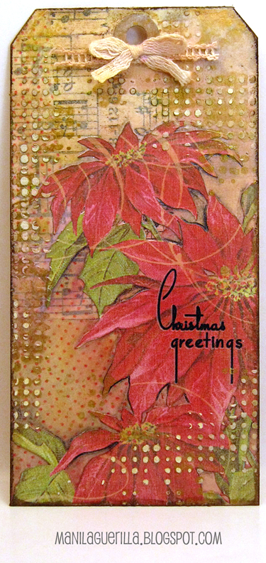
Since the florals die-cut is on my wish list (are you listening, Santa?), I modified this element by using a scrapbook paper cut-out of poinsettias instead.

There's plenty of tissue tape, though, and also Plain Tissue Wrap stamped with red archival ink using the Dots and Florals stamp.


I used the Dot Fade stencil which, out of the package, has a modern, high-tech appearance but by applying texture paste randomly and then using gold paint for highlights, I was able to create a vintage look that coincides with the Christmastime remnant rub.

November 18, 2016

12 Tags for Christmas - February


Monoprinting (a great way to get more mileage out of stencils) and embossed texture paste were the techniques presented in Tim's February tag--here's my Christmas version.

I stayed true to the monoprinting but....

The stencil image (a doily) just didn't develop like I wanted it to so I placed the stencil back over the printing and used paint through the stencil's negative shapes in the traditional fashion.

Without the special texture paste that Tim used, I had to improvise. But I came up with an alternative that yielded a new stencil in the process.

I stamped text on Yupo and cut out the letters to make a stencil then used brown-tinted paste medium covered with glitter.

I've said it before--Yupo makes great stencils (cuts like butter, is durable and easy to clean) and now I have a stencil I can use for future projects.


I love the Santa image from Tim's 2016 Christmastime Ephemera Pack (wish there was more than one) and framed it with tiny dots of Ranger's Liquid Pearls.

Stencil credit: The Crafter's Workshop (Mini Tatting), Stamp credits: Stamper's Anonymous (Christmas Words) and Inkadinkado (Christmas Silhouettes)

October 10, 2016

Science Guy


Made to link-up with Tim's 12 Tags for 2016, this is the 41st tag I've made for the year not counting all the boo-boo's that ended up in the trash (Halloween pun intended).

It's a little plain Jane, especially for Halloween, but I lean towards "less is more" (perhaps just an excuse for not knowing what to do next). However this time, I did summon the courage to add some tiny black splatters and for me that's a step in the right direction.


Tim's technique started with a collage background of paper bits then a covering of crackle medium. I discovered first-hand that a thin application yields tiny cracks (background) and laying it down thick on the frame/tag borders (I used a fine-tip squeeze bottle) changed the look completely.

(Click on photos for a larger view.)


Obviously, my "Science Guy" isn't one of Tim's metallic monster masks but you have to admit this photo is just as bizarre. We can only assume this gent may have been a little impoverished (note the clever way he's buttoned his jacket) and I have no idea what he's cooking but it looks a bit suspect to me.


I used the skull from Tim's Mini Halloween Set #5 and also one of his Vellum Ephemera pieces painted off-white on the back and then distressed by sanding, wrinkling and inking.

To fill in the empty spaces, I mixed some texture medium with paint to match the shade of the medicine label and applied it through Tim's Dot Fade stencil before splattering the tag with watered-down black paint.

July 11, 2016

Ten Degrees


Here's a journal page to share with you today. I've been working in a large Dylusions journal creating two-page spreads--it's almost one-third full and getting much too thick to manage.

So I removed the completed pages and made a separate binding for them. Now my journal is nice and flat again and this time, I will work on just one side of the page and see if I like it better.

Today's page was inspired by this photo from a blog I've recently started following. It began with a background made from the corners of envelopes clipped by my great Aunt for her postage stamp collection (when I removed the stamps, I kept the corners to use for collage projects).

I applied the photo via an image transfer and used Postale tissue paper (Tim Holtz) in the foreground. The top of the collage was stenciled with texture paste (Tim's Dot Fade).


To enhance the areas the girls are standing on, I added additional lines with a permanent marker and used a bit of white paint to lighten the squares.

I wanted to retain the vintage colors so very little additional tint was applied except for some minor shadows made with a black colored pencil.

I am really grateful to this unknown photographer who captured such an inspirational image (and to the website for sharing it). Working on this page was really a pleasure. I wish I knew what a fisherman's store is but think it may be a warehouse. Can anyone enlighten me? Then I wonder what in the world these girls were doing there!

July 02, 2016

Condo


I've had trouble creating lately. I've shown up for the work but the results just weren't satisfactory. Hopefully, I've learned from my mistakes and the worst is over. It really has thrown me for a loop and even the purchase of a few new supplies didn't help!

So a thank-you is due to Maura Hibbits, who developed a tic-tac-toe board for this week's Monday challenge blog at Simon Says Stamp. Her clever idea allowed me to finally complete something and I opted to go all-in, using every element.


My tag is a layer of washi tape, corrugated cardboard stenciled with paste, birds stamped on fabric, sprayed and stained with blue and green distress inks and a light wash of gesso, some sequins, gold threaded ribbon and gel pen doodled dots.

I imagine it looks like an abstract bird condominium, hence the title of my blog post.