Showing posts with label shabby chic. Show all posts
Showing posts with label shabby chic. Show all posts
June 14, 2020
Girlfriend
I would say my greeting cards look a lot like the tags I make, or a journal page, for that matter. Here I have assembled one using a hand-cut botanical print, a Found Relative and some Collage Paper (Tim Holtz) onto a book page stamped with a French postage mark. I machine-stitched a border and embellished it with 3D paint (Liquid Pearls).
Everything was tinted with Distress inks and I used a watered-down layer of off-white paint over the girls dresses to change their appearance.
I think a key element in this composition is the addition of dark shading behind the girls which gives it some dimension. And it was mounted onto a kraft paper card base which reinforces the vintage vibe.
As always, I hope this post finds you well and happy and I appreciate your visit.
Until next time, take care.
May 05, 2018
Moments in Time
Time. Oh what a topic and such a precious commodity! It's the theme at Simon this week and here's what I made.
Crafted from some Idea-ology bits (pocket watch, flowers) and the new Worn Wallpaper, it was assembled with a homemade box and basswood strips. The support for the pocket watch is a small wooden tag turned upside down.
A vintage image was placed under the dome of the watch and I embellished it with a ball chain. The quote is an image transfer.
December 01, 2017
12 Tags for Christmas 2017 - Joy to the World
♪♫ ♪ "On the first day of Christmas, my true love sent to me ..." ♪♫♫♪
Ten years ago today, Tim Holtz began the tradition of blogging about techniques for creating 12 Tags for Christmas and I've continued to make them every year since then to decorate my presents.
This year, I decided to post them in 12 consecutive days beginning December 1st just like he used to do and my first tag features a simple, understated design with an early American or Georgian vibe.
The background is pearly paper with clear-embossed snowflakes (Kaisercraft Frosted) that was tinted with Faded Jeans Distress Oxide.
I coated the book paper die-cuts (Carta Bella Joy Wreath) with Glossy Accents and created additional contrast by using a blue gel pen and a water brush (which soaked in underneath).
I gave the entire surface a wash of dilute white acrylic paint and took advantage of the resist properties of the Glossy Accents by wiping the paint away from the die-cuts where there was overage.
I used a Remnant Rub to complete the phrase and made a frame border with 1/8" silver metallic ribbon (Offray) tinted with off-white acrylic paint.
To age the appearance a bit more, I rubbed on Frayed Burlap Distress Ink here and there and added some Liquid Pearls along the bottom for a touch of Christmas bling.
May 11, 2016
Poemata.
Poemata. That's Latin for poems. This word, along with a British Museum seal (in red), appears in their Flickr photostream where they have scanned and made available to the public over 1 million images. The small ornate frame with the word and number Tomo III also came from the stream.
I can't remember where the butterfly (actually a Luna moth) came from but it's an image transfer (along with the words) and appears brown because the particle board surface of my support is that color.
The wreath (Prima Noble Darling) was stamped onto old book paper and cut out, the lace was "borrowed" from a card a friend of mine gave me and the border was made with Liquid Pearls (Ranger).
The background text (Tim Holtz Ledger Script) was stamped with Ranger archival ink (Potting Soil) and the support is actually one of Tim's 4" x 6" burlap panels sans the burlap. There's also a tiny strip of white mulberry paper on the left-hand side.
I like working small so this was a good size for me and you can pull out more stops on wood than you can a manila tag. Maybe I've found a new calling? We'll see.
April 18, 2016
No. 526713
This week's challenge is to use a Butterfly and my idea for this tag started with one I found in my Wallflower Vellum paper stash.
I cut it out and cropped it to fit inside an Idea-ology Journaling Ticket stamped with some background text (Ledger Script) using archival ink (Ranger Potting Soil).
I built a box for it by scoring 1/4" from the edges of a rectangular piece of heavyweight cardstock then folding up the sides and securing the corners.
The box was lined with a vintage dictionary page and I attached the ticket using my sewing machine. A Small Talk sticker was tinted with Antique Linen Distress ink and placed on top.
The stitching made me think of using a textile background so, after tinting the tag edges with Walnut Stain Distress ink, I cut a piece of fabric (Eclectic Elements) and stitched it to my tag.
In case you're wondering, sometimes I peel off the reinforcement paper around the tag's hole punch before adding background papers, etc., then reapply it (which is what I've done here).
After a few practice runs on some scrap fabric, I stamped the tiny butterflies on a string (Prima Noble Darling) using, of all things, ink from a Fude Ball pen. I needed a real juicy application to get a good image on the fabric and this pigment ink pen did the trick.
To create more visual interest, I intentionally offset the placement of my tag elements including the Lace Trimmings along the bottom edge of the box.
I stitched on a button (that matched the coloring of the vellum butterfly) as well as some string tinted with Black Soot Distress Ink to help draw the viewer's eye up and over the box and match the playfulness of the tiny butterflies.
----------------------------------------------------------------------------------
I do hope you'll join us for this week's challenge--
what kind of butterflies inspire you?
And don't forget when you upload your creation to the Simon Says Stamp Monday Challenge Blog you'll have a chance to win a $50 voucher at the Simon Says Stamp store!
Here's a list of the products I used for this challenge which can be ordered from Simon:
February 12, 2015
Dear Thelma
My dear friend Thelma (I'm Louise), introduced me to rubber stamping a few years ago and, without sounding overly dramatic, my life (and my storage requirements) have never been the same since.
This is the card she will receive from me this year which began as an image transfer on watercolor paper, then resist embossing, layers of distress ink and lacey ribbons added to embellish.
The shiny border dots are Liquid Pearls, a 3-D paint by Ranger that's a bit tricky to apply but creates a great effect when you want some old-fashioned glam.
I'm linking to the Monday blog challenge at SSS where this week's theme is Red and Pink.
April 04, 2014
Shabby Chic a la Morocco
I love a good challenge and Tim's tag for April was just that. Not using a die cutter means working the hard way but it forces me to think outside the box and makes for more original artwork. I always try to incorporate whatever technique he highlights but make a point to put my own spin on it.
This tag went through many transformations (thank goodness for gesso, the great cover-up) and I'd be hard pressed to say exactly how it was made. But the ingredients were corrugated cardstock, a modified stencil (courtesy of Lowes), an Exacto knife, various tissue tapes, acrylic paint, Distress inks, sand paper and a fine-tipped marker. My flower was made using a technique from Clare Buswell and the leaves were cut from watercolor paper.
I really enjoy Tim's monthly feature and had so much fun working on this tag. I am grateful for his inspiration as well as the opportunity to link up and I always look forward to seeing what others will make. Thanks for stopping by!
December 08, 2013
Santa Baby's Got Bling
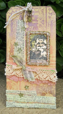
This tag was created for Ellen Hutson's 12 Tags of Christmas with a Feminine Twist challenge and was inspired by Julia Stainton's "shabby chic" tag from Day 6.
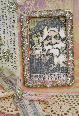
I used an emboss resist technique to create the background on a plain manila tag with a Tim Holtz Christmas stamp (placed in multiple areas to cover the entire surface) and some Distress Inks (Dusty Concord, Vintage Photo, Tea Dye and Spun Sugar). To keep it looking shabby, I lightened the colors here and there with Picket Fence Distress Stain.
Santa's image (another Christmas stamp by Tim) was tinted with Distress Inks and placed in a glittered frame. I used my sewing machine to attach the lace trimmings then added strips of home-made washi tape and some glittered stars.
Thanks for the inspiration, Julia! I really like shabby chic and my whole house would be in this style but the king of this castle is none too crazy about it. If you like it too, then check out Crooks & Nannies, a favorite spot of mine.
Subscribe to:
Posts (Atom)


