/* */ Beulah Bee: watercolor
Showing posts with label watercolor. Show all posts

June 10, 2023

Window Cat Times Three

I really like this stamp (Colorado Craft Company, New Day Windowsill), so I used it to make three more greeting cards that I'm sharing with you today.

The first one was cut-out after water coloring, placed on a stamped background (Tim Holtz Tiny Prints), and trimmed with Nuvo Crystal Drops and a Remnant Rub.

The next one was left on the watercolor paper (hot press), placed on a stamped background and trimmed out with lace and another Remnant Rub.

The final card (which is my favorite) was also cut-out and mounted as above. I tinted the tiny flowers in the background with white ink, distressed the edges with walnut ink and trimmed it with Nuvo Crystal Drops and a stamped greeting (from the set).

I tried to select sentiments that conveyed contemplative thoughts--human or feline.☺

As always, I hope this post finds you well and happy and I appreciate your visit.

Until next time, take care.

May 28, 2023

New Day?

It's been a long time since I've posted--I've had the time but lacked the inclination. Worry about the economy, the open border, high crime rates, etc., has dampened my creativity and I'm struggling to overcome it.

Maybe today will break the habit--a new day--and it's no coincidence that my post features a stamp set called New Day Windowsill by Colorado Craft Company.

I used watercolors and stamped a background (Tiny Prints by Tim Holtz).

Here's another version mounted on scrapbook paper (Asuka Studio).

It was fun to play around with different shades of green but I have a tendency to over-work the colors. Practice is the only way to overcome this.

I'm linking up to Simon's Monday challenge, this week it's Watercolor.

As always, I hope this post finds you well and happy and I appreciate your visit.

Until next time, take care.

December 19, 2022

No. 9 for Christmas, 2022

For this tag, I created a landscape with watercolors using a few stamps. I was mindful of my color choices (and their intensity) in order to create a sense of depth and realism for these somewhat contrary subjects. A general rule of thumb: Keep your colors dark and bright in the foreground, light and dull in the back.

I like to use hot press watercolor paper because the smooth surface makes the stamped images crisper. I trimmed the border with platinum Stickles and used Stampendous Clear Snow glitter on the branches and berries. The text and snowflakes are Remnant Rubs.

As always, I hope this post finds you well and happy and I appreciate your visit.

Until next time, take care.

December 01, 2022

No. 4 for Christmas, 2022

I took inspiration for this tag from the cover of a vintage magazine (see it here). I traced the ornament design on watercolor paper and tinted it. I messed-up the background so I had to cut it out instead. It was pasted on Tim Holtz Christmas papers and embellished with Stickles.

As always, I hope this post finds you well and happy and I appreciate your visit.

Until next time, take care.

August 13, 2022

A Simple Life

Postcard

Sharing more "postcard art" today made with two stamps, a Clippings Sticker and tinted with inks, watercolors and colored pencils.

As always, I hope this post finds you well and happy and I appreciate your visit.

Until next time, take care.

July 17, 2022

Colorado Corners

Greeting Card

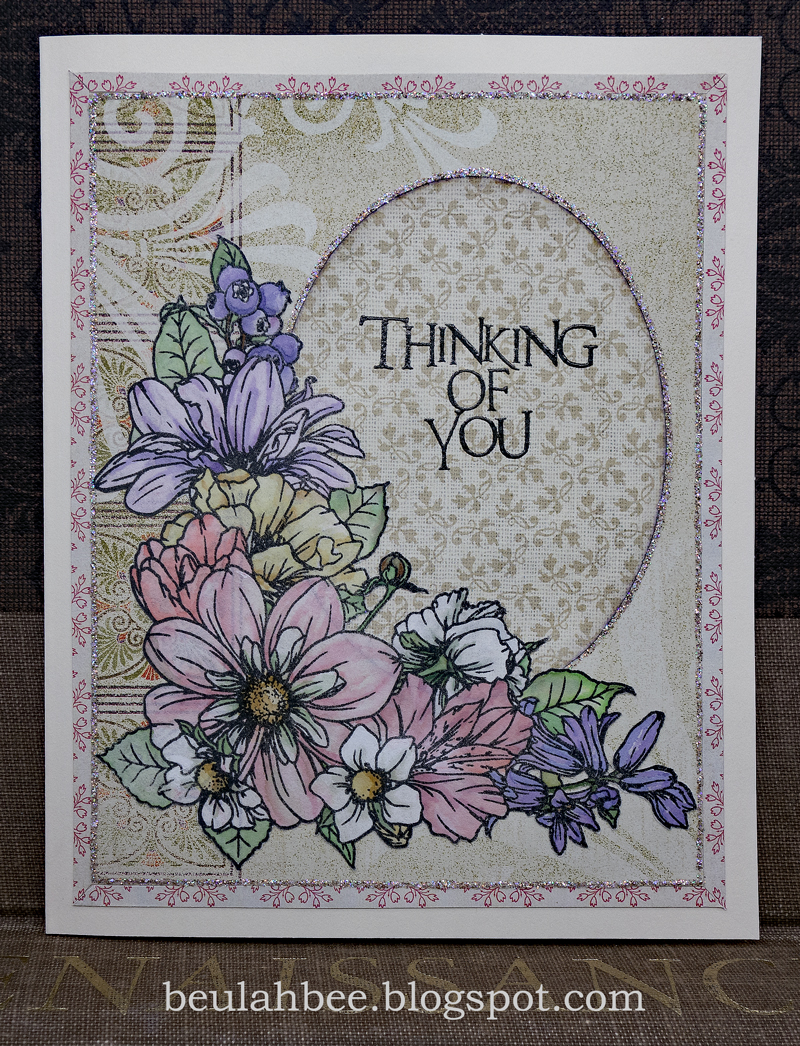
I used a new stamp set for this card and I'm linking-up to Simon's challenge--this week it's Fabulous Florals.

The set is called Floral Corners by artist Kris Lauren for the Colorado Craft Company.

It was stamped on rice paper, tinted with watercolors, fussy-cut for mounting on scrapbook paper, and embellished with Stickles.

I used rice paper because it's easy to cut and plan to alter future stampings of this design to change-up the cornered layout. I just love the stamp's delicate design but a tiny brush was a must for tinting.

As always, I hope this post finds you well and happy and I appreciate your visit.

Until next time, take care.

May 13, 2022

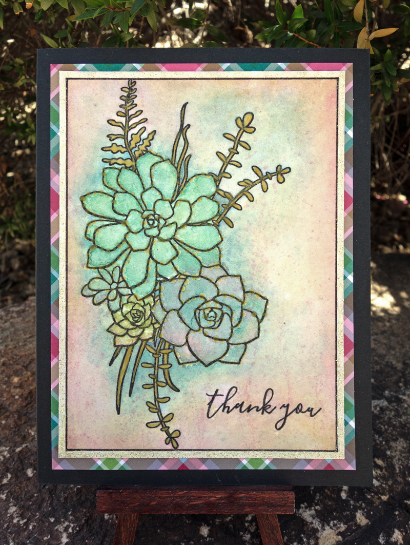
Hero Arts Succulent Bouquet


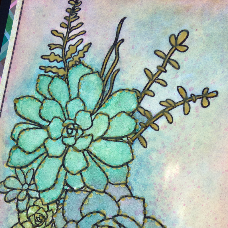
I purchased a new stamp set and used it on hot-press watercolor paper. Ever experimenting, I used an olive green shade of Nuvo Crystal Drops to fill some of the leaf areas then couldn't help but throw down some dots around the flower edges.

I created a border with a fine-line marker and green gold Nuvo Glitter Drops. It was mounted on plaid printed paper with a black card stock foundation.

As always, I hope this post finds you well and happy and I appreciate your visit.

Until next time, take care.

April 17, 2022

Sweet Pea

Greeting Card

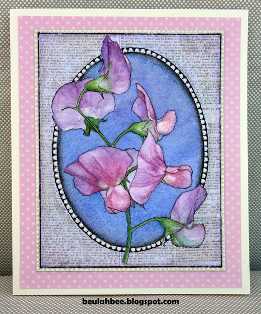
I traced an image of a Sweet Pea then used watercolor for tint, created a background mask from scrapbook paper and used a fine line marker to create the frame borders.

To create the mask, I used deli paper to trace an outline of the oval and flower parts then inserted the tracing on top of the scrap paper for cutting.

For better emphasis, I later outlined the watercolor drawing. Maybe I am so used to stamped images that the no-line effect just didn't seem right to me.

I used dimensional dots for accent (Scribbles) and I left off any text so that I can customize the card when I'm ready to gift it.

I'm linking up to the Sweet Treat challenge at Simon.

As always, I hope this post finds you well and happy and I appreciate your visit.

Until next time, take care.

April 09, 2022

Easter Greetings

Greeting Card

Welcome to a longer post today to explain my inspiration for this greeting card and to share some family memorabilia.

It was made with an old pillow case scrap and I traced a design that was machine- and hand-stitched, tinted with watercolors and framed on texture-embossed mulberry paper.


I took my inspiration from a collection of vintage embroidered postcards sent to my great Aunt Esther by her brother (my grandfather) from France in 1918 when he was a soldier during World War I.


The cards were made with machines that imitated hand embroidery and were provided with patriotic, romantic or religious messages. They were sent home by the officers and soldiers that lived and fought in the trenches of northern France. You can learn more about them here.


These were mailed in an envelope to protect them, were lovingly stored for more than 100 years and are in excellent condition. One has an inscription on the back which reads, "Dear Esther, the money enclosed is worth 17-1/2 cents American money. That's what these postcards cost a piece."

It's worth noting that my aunt was an avid postcard collector so I expect she was overjoyed to receive them. Though her greatest joy, I'm sure, was when the war ended and he returned home. My grandfather was very young when he served and the experience had a detrimental affect on his mental health.


My hope for Easter this year is to see an end to the war in Ukraine and I will pray for it.

I'm linking to Simon this week for their Easter/Spring challenge and my card will be mailed to my good friend, Thelma, who introduced me to card making many years ago.

As always, I hope this post finds you well and happy and I appreciate your visit.

Until next time, take care.

H A P P Y   E A S T E R !

March 24, 2022

Sunny Bee

Greeting Card

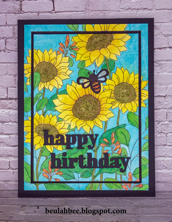
Prompted by Simon's Monday challenge to make something "Bright and Cheerful," I chose to use their Sunflower Garden stamp set and a mix of watercolors.

My somewhat less conventional mounting was done by cutting the watercolor 1/4" from the outside edge leaving two pieces, trimming the inside piece again to create a gap and then reassembling on black cardstock.

The text was die cut in multiples and stacked for dimension. The bee was cut from a pattern and lined with tissue paper to provide body color and luminescent wings.

As always, I hope this post finds you well and happy and I appreciate your visit.

Until next time, take care.

February 23, 2022

Archibald

Greeting Card

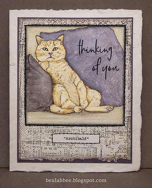
I came across an image in a woman's magazine that inspired this greeting card. I used a technique where you make a grid over the original with a smaller scale version on the support you plan to transfer to and took these photos to illustrate.

Here's a link to a video tutorial if you like to know more about this technique.

I used a fine quill pen nib and black india ink to go over my pencil drawing. Then it was simply a matter of tinting it with watercolors.

I finished it off by stamping a patterned border and a greeting. I made a typewritten "portrait" label and machine-stitched it to a piece of mulberry card stock.

As always, I hope this post finds you well and happy and I appreciate your visit.

Until next time, take care.

December 24, 2021

Christmas Tag No. 7 for 2021

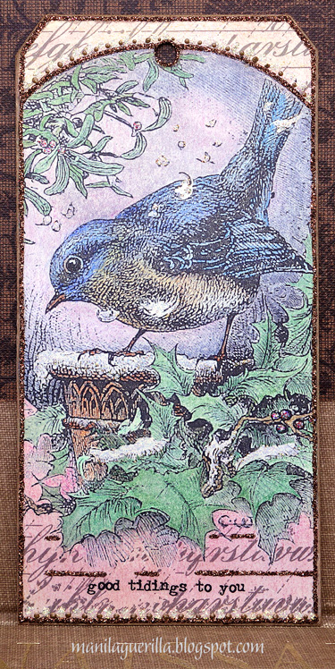
Couldn't help but use an image I stumbled across at the British Library's Photostream for a Christmas tag which I printed on regular computer paper then tinted with colored pencils and watercolor. I stamped the top and bottom to fill-in the white space (Tim Holtz Faded Type) after pasting on heavy-weight kraftstock cut to the shape of a #8 tag.

While it's hard to see, I used a white glitter glue (Stickles) over the snow areas and trimmed the borders with brown glitter and Liquid Pearls. The text is a Remnant Rub.

Merry Christmas Eve, everyone, I wish you the happiest of times with the ones you love.

December 04, 2021

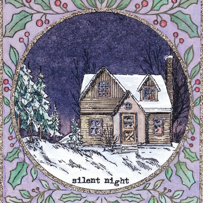
Silent Night

Greeting Card

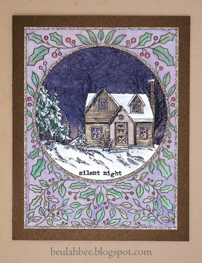
Here's another try at a two stamp combo--this time it's a night-time version (see previous post for a look at my first try).

I lightened up the foreground stamping by using gray ink. I guess the next thing to try with this stamp might be a "no-line" watercolor version.

You might be curious to know that the dark sky was made by mixing ultramarine blue and orange lake and I lightened the tint at the horizon line to create the illusion of depth.

Greeting Card

As long as you have a tiny brush handy, painting small watercolor scenes like this one are fast, easy and very satisfying!

I mounted my stamping on bronze metallic cardstock and used champagne-colored Stickles so I'm linking up to Simon's "Sparkle Mode" challenge this week since I made something glittery.

As always, I hope this post finds you well and happy and I appreciate your visit.

Until next time, take care.
Stamp sources: Pink Fresh Happy Holidays Circle Frame, Studio Light Christmas Scenery

December 01, 2021

Peace

Greeting Tag

Two stamps, one piece of watercolor paper and paint, topped off with glitter glue, glossy accents and a Remnant Rub and I've just made another card for Christmas.

Greeting Card

I might make another one but I'd stamp the holly border much lighter or knock it back with paint because I feel it competes too much with the scenery focal point.

I'm linking up to Simon's "Sparkle Mode" challenge this week which is to make something glittery.

As always, I hope this post finds you well and happy and I appreciate your visit.

Until next time, take care.
Stamp sources: Pink Fresh Happy Holidays Circle Frame, Studio Light Christmas Scenery

September 12, 2021

More Sunshine Flowers

This image (from Simon's Sunshine Flowers set) was stamped on hot press 140 lb. watercolor paper and then fussy-cut. The flowers were tinted with dollar-store markers and water. I added some Liquid Pearls to embellish. The die-cut text was layered using three stacks.

I'm linking to Simon's Monday challenge, this week's theme is "stamp it."

As always, I hope this post finds you well and happy and I appreciate your visit.

Until next time, take care.

August 15, 2021

Glitter Gone Wild


Gitter gone wild is the name of this post for obvious reasons--I used it to embellish this birthday card for my niece. (If you click on the photo to view it in the light box feature you'll see the glitter in more detail.)

I began by stamping (Simon's Delicate Flowers and a Martha Stewart butterfly) on watercolor paper with clear embossing ink and UTEE. Remember this stuff? UTEE stands for ultra thick embossing powder and I guess it fell out of favor because I seldom see anyone using it anymore.

After applying watercolors for tint, I ironed off the embossing. When you do, the weight of the iron spreads the embossing out and you end up with slightly thicker lines that also act as a resist. If you'd like to know more about this technique here's a link to a popular post for the particulars.

I thought I needed more contrast so I outlined the images with a fine-tip black marker. Still not happy, I dug out my glitter (Stickles) and the extra color and sparkle seemed to do the trick.

I used a stencil (Simon's Tiny Dots) with white texture paste, a Simon die-cut for the sentiment and machine-stitched it to the card base using white thread.

Simon Says use heat embossing this week so I'm linking up to the Monday challenge.

As always, I hope this post finds you well and happy and I appreciate your visit.

Until next time, take care.
January 27, 2021

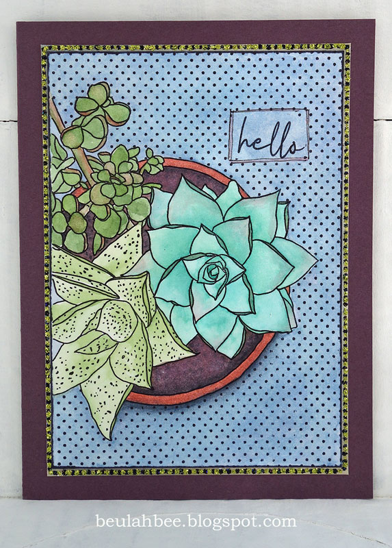
Hello

Mondo Succulent Pot
 

Not sure what to make of this greeting card--I like it but I know it's not for everyone (it's not very conventional).

I used a newly purchased stamp by Ellen Hutson called Mondo Succulent Pot. I've had my eye on it ever since it was released (2019) and after using it the first time, I know it will be quite versatile. I'm glad I got it and expect to use it a lot.

It was watercolored but I didn't like the blue background (too plain) so I stamped over it with polka dots (Tim Holtz). I framed it with a layer of paper then that little voice inside my head said use some Stickles and now it has yellow-green and black dots of bling.

If you're new to watercolor, a large stamp like this is ideal. I'm not a fan of "no-line" techniques and with a hand-drawn stamp like this one, the lines are what make it so charming.

One criticism about the stamped text: The set comes with the word "Hello" but honestly, the way it was made/written it looks more like "Hells" (here's a link to the vendor if you are curious). So I scratched out the center of the letter "o" because I thought it would help. Maybe I'll find a better remedy when I use it again. Maybe it's just me?

As always, I hope this post finds you well and happy and I appreciate your visit.

Until next time, take care.

July 26, 2020

Live Out Loud


Altering vintage photos seems to be my thing these days and each one I work on is a lesson in techniques--some that work and some that don't.

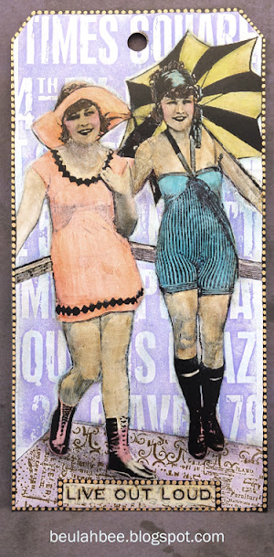
I used Photoshop to print this photo on manila cardstock after cropping it to a 6.25" x 3.125" format (the size of a #8 tag).


Then I used watered-down gesso to cover almost everything in the photo. This provides a surface that water-based inks or paints (I used watercolors) can adhere to. So, unless the tint is staining, it's easy to remove/change colors with water and tissue to erase it.

To stamp the background, I used masks cut from deli paper which is see-thru and easy to trace and cut.


I've mentioned before that I use the tip of an Xacto knife to scratch away shadows or other dark areas to make some areas read better. You can see an example of this where the woman's hair blends into the dark areas of the umbrella.


I used a Remnant Rub for the text and embellished the black line borders with dots from an orange SoufflÄ› gel pen. I'm linking up with Simon's Monday challenge for A Day at the Beach.

As always, I hope this post finds you well and happy and I appreciate your visit.

Until next time, take care.

July 12, 2020

Good Bye Old Paint


I thought I'd dig out my watercolors and paint a card or tag for Simon's Play with Paint prompt this week. I didn't know I would end up making a color mixing chart instead!

One look at my badly neglected palette (bought years ago by way of a recommendation when I was just a beginner) and I knew it was time to take care of it. The paint was dry and cracked, some of the wells needed to be refilled, etc. It has served me fairly well but truth be told, it is way too big for my needs today and I decided to replace it.

I found a smaller, air tight pallete at Amazon and set about transferring paint from the old one to the new one. It was a tedious undertaking but my paint is expensive (Maimeri Blu from Italy)--I didn't want to waste it and two of my favorite shades are no longer available.

No, I'm not about to tell you how I scraped and reconstituted paints ☺--I just have a few more photos of the palettes then I'll share some links for two really useful websites to learn about watercolor paint properties and how to make color charts that I think you'll appreciate.


If you are a beginner to watercolors (or even if your not), here's a link to excellent, step-by-step instructions for why and how to make color charts (which I used to make mine):


Making the chart was so useful and such a good way to learn about paint properties, to practice control of mixing, and to learn how to get just the right color.

Mine was made large enough to reflect the 18 colors I used in my new palette and it will be an excellent reference going forward. I discovered some new combinations that I can't wait to try!


And finally, I'll share this link for a really good explanation on watercolor paint properties which I frequently use as a reference:


For the most part, watercolor is easy (with good supplies) but what held me back the most was not appreciating that some paints stain, some are opaque, some get muddy and you can't figure out why, etc. This website provides a good explanation and doesn't bog you down with too many details. I highly recommend it.

As always, I hope this post finds you well and happy and I appreciate your visit.

Until next time, take care.

December 13, 2019

12 Tags for Christmas 2019 - Snow Berries


I've got carols a' playing as I prepare this post (David Archuleta's "Winter in the Air") and I am grateful for this time to play and for music of all kinds that I simply couldn't live without.

Stamping of holly berries (Mondo Holly by Julie Ebersole) on watercolored paper along with a bird cut from the Tim Holtz Wallflower paper stash, snow flakes courtesy of a Simon stencil--that's what I used to make tag number 7 of 12 for 2019.


I thought you might appreciate the technique I used for masking and alignment of my stamping so here's a photo to illustrate.

I taped together the masks, laid them on the tag and used an ink blending tool and light colored ink to tap along the mask edges to create an outline I could use to accurately align my stamping.

I'm linking this post to the TFJB Challenge Blog: It's the Holidays.

Use the link on the sidebar or the 12 Tags label at the bottom of the page if you want to see more of my Christmas tags.